Yeah now theres screens. Obviously not much since I just started working on it, BUT, showing screens actually gives me more motivation to work on it.
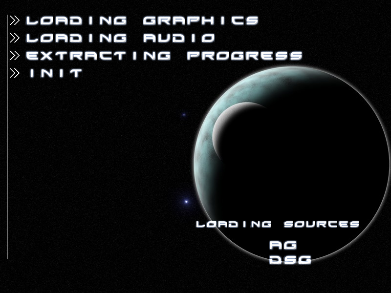
 Quick loading screen for all external files.
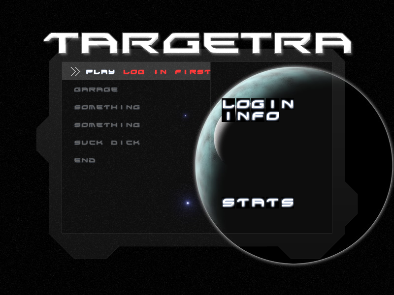
 Menu so far. Button text moves smoothly. Box needs improvement, but not too important atm. Title is not final..So its not much but a start. And with that comes the need for feedback and suggestions for the next steps.The lobby should include the gametype and server names. But inside each game have the options for gametype, the default ships choice, maybe obtacles and powerups. I dont think Im missin anything.question: So there should be a grid to show the game being isometric right? Otherwise it would be semi-weird flying in space in that view… hmmAlso need sounds for gameplay, and suggestions for how the 'Credits' vs Score and that whole system. Since the score will go online with some stats, but not credits… at least i dont think so.anyway discuss!EDIT: Do you like the font? (yes the glow needs work to look better, but the overall style?)
Very faint grid, very very faint - almost not visible, but enough to notice the movement.
Looks pretty good so far. :Dhuh? my alias makes a guest appearance in your screens??
indeed it has. congratulations.
@RamboFox: Thanks. I think thats what I'll do.@sir xemic: its just a quick loading screen that will last probably 1 second. the 'sources' are just there to take up space, and are not the real credits.Looks nice, love the menu.
The only thing thats bugging me is the spaces in "LOGIN"It bugs me.@Cpsgames: [and Alert] When you draw the text, i assume you're using a sprite font? make it an additive blend mode :]
I am dammit what the hell did i do with the other text!
…j/k but why criticize my placeholder text lol. I didnt do the login yet.@sir Xemic: no its abbreviated like you said the first time. haha i assumed you wouldve figured that but meh.