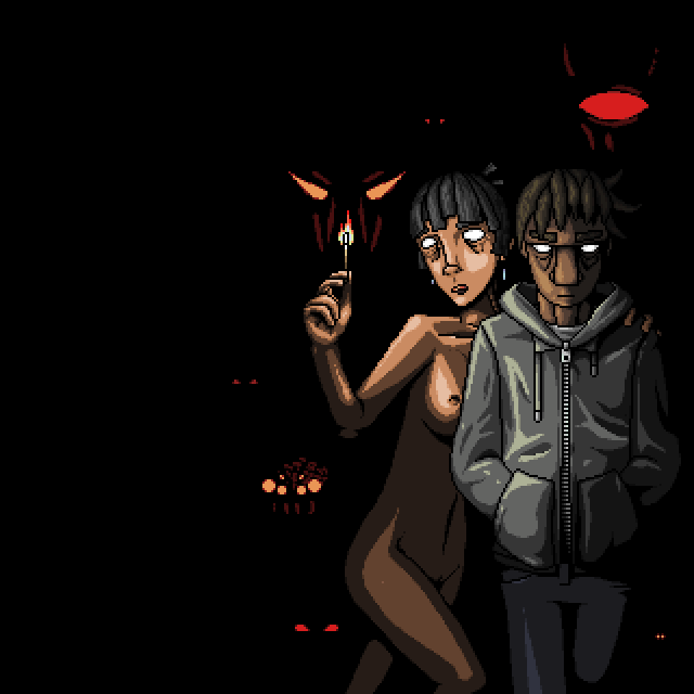
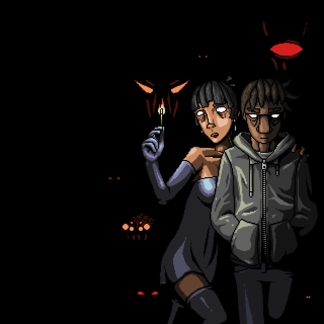
I love it when bands do acoustic versions of things. Though, Sum 41 has a tendency to make them Japanese bonus tracks, so I just earlier discovered the existence of this.To the point:The other day I had a thought; how long has it been since I've made artwork for the sake of making artwork?See, I usually do artwork for a reason; either art for a game or art to pass the time. The last time I actually put effort into making an image for the sake of making an image was that watercolor painting I posted a while back.So I set out to make a composition for a pixel art drawing, which started by doodling ideas in my Nutrition class.The composition originally had nudity planned.I considered the implications of this, but then I realized something.I keep forgetting that lately.Anyways, I ended up making two variations, one with nudity and one without. Though, the clothes I added are quite obviously an afterthought, so I don't like that one nearly as much.These are they:Original (nudity)
SFW version
And yeah, that's the chick from my class-doodles.So what do you think?I'm actually proud of these, which I usually never say about anything I do.Also, I made a new music track with the intention of it being not video-game music, and instead being music to listen to. I didn't quite achieve that intention, but I feel like I got at least half-way there. Some of you already heard it, I wanted to reply to your comments but I couldn't figure out how to make an untimed, reply comment.Part of the reason I made a second version of the drawing is that I was toying with the idea of using it as album artwork for some future musical compositions, and I figured that nudity would be unwarranted in that scenario because I'm not an 80's progressive-rock band.That's all for now.EDIT: WAIT NO I FORGOT.I have a Bandcamp now, and you could buy Extraspiritual Transalienation if you were so inclined. It's like, 1 dollar for 16 tracks. That's ~6 cents per track. I don't know why I even made a Bandcamp… presumably just to have.


I think the dress makes it look more detailed. The nude version feels more empty.
Great work, man. Though something about the girl's anatomy seems off… Her shoulders seem a little short. The clothes in the SFW version seem to hide this issue. Otherwise, I like your shading. You have a knack for pixel art.