Marry Krastmiss, people. And those who don't happen to celebrate it– Happy Wednesday, and for those that live in future civilizations such as Australia, Merry Thursday, for those not a fan of the Gregorian Calender format, apocalypse comes soon.ANYWAY, I'll keep this brief as I have a lot of work to do.This is what I've been up to since my last blog, art-wise.This one piece took me 3 days, including color. 3 FULL days, like 10 hour sittings with no breaks. I also passed out in my chair at my desk all two nights, sooo. It was fun. Never doing this again.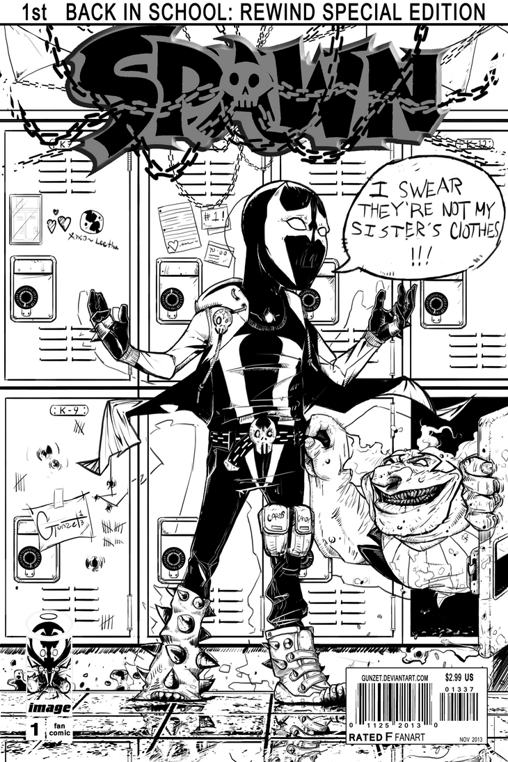
 A sketch that let me know I still need to work on female faces
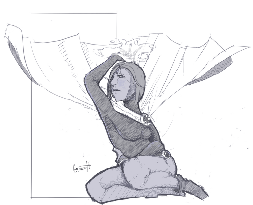 Sketchy
 Sketchorz
 Sketchums
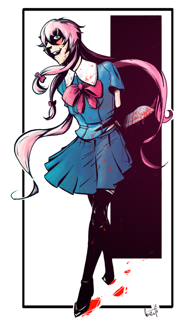
 And a finished $20 commission for KyleKubrik (I'm getting to yours very soon, Steven.)
 —Writing Here—I had an epiphany– I draw better, think clearer and concentrate harder when I draw traditionally rather than digitally. Holy shit. I mean I've always been a traditional draftsman, but I made the switch to digital around 5 years ago now, and I haven't really looked back outside of school assignments. When I opened my sketchbook after numerous failed attempts to bring my comic pages up to my preferred standard or style and jotted down those first few test panels and character sketches, my mind was blown.Ever since that realization, I've been working traditionally with pencil and eraser, and my nib pens and markers I had rarely used beforehand. Now this doesn't mean I'm abandoning digital art, but what it -does- mean is that I'm bringing both mediums together for the first time in a more fulfilling way for me rather than scanning a super rough sketch and digitally doing the rest. No. I'm splitting all the work 50-50 now, and it's been working awesomely.Which brings me to my most exciting announcement.My comic! Not the crazy depressing one I wrote about a few blogs ago. This one is based off of one of my old games that has failed with every attempt (like 3 times) since it came into existence in 2009. I've been wanting to bring these characters to life in SOME way ever since their initial sketches in 2008, and it's finally happening. Here is a work-in-progress teaser of the cover and page 1. All line-work is completely pencil, except for the cover, which is traditional inking. The colors are digital, as well as the header.Psycho PlacePages: ~22Issue #1 Preview: "I Wonder…"
 I'm not doing a page-per-week format or whatever. I'm doing full issue uploads when they're completed, which should be 1 a month if I can stay on track. So expect the full thing by December 31st!Until next episode

 A sketch that let me know I still need to work on female faces
 Sketchy
 Sketchorz
 Sketchums
 And a finished $20 commission for KyleKubrik (I'm getting to yours very soon, Steven.)
 —Writing Here—I had an epiphany– I draw better, think clearer and concentrate harder when I draw traditionally rather than digitally. Holy shit. I mean I've always been a traditional draftsman, but I made the switch to digital around 5 years ago now, and I haven't really looked back outside of school assignments. When I opened my sketchbook after numerous failed attempts to bring my comic pages up to my preferred standard or style and jotted down those first few test panels and character sketches, my mind was blown.Ever since that realization, I've been working traditionally with pencil and eraser, and my nib pens and markers I had rarely used beforehand. Now this doesn't mean I'm abandoning digital art, but what it -does- mean is that I'm bringing both mediums together for the first time in a more fulfilling way for me rather than scanning a super rough sketch and digitally doing the rest. No. I'm splitting all the work 50-50 now, and it's been working awesomely.Which brings me to my most exciting announcement.My comic! Not the crazy depressing one I wrote about a few blogs ago. This one is based off of one of my old games that has failed with every attempt (like 3 times) since it came into existence in 2009. I've been wanting to bring these characters to life in SOME way ever since their initial sketches in 2008, and it's finally happening. Here is a work-in-progress teaser of the cover and page 1. All line-work is completely pencil, except for the cover, which is traditional inking. The colors are digital, as well as the header.Psycho PlacePages: ~22Issue #1 Preview: "I Wonder…"
 I'm not doing a page-per-week format or whatever. I'm doing full issue uploads when they're completed, which should be 1 a month if I can stay on track. So expect the full thing by December 31st!Until next episode

Yeah, you just keep getting better and better!
kyaaaaaa! i'm so excited for your comic. the style looks great, i can't wait to see what the story is about. and full issue releases ftw! :)
That is a very manly looking Yuno, but I have to say your stuff looks fucking excellent in color.
@Toast: When I'm motivated, I get ~MotivateD~, and so stuff like this happens for a while, lol. My only thing is that once I realize I'm on a motivation binge and I'm bound to fall into the pit again, I get kinda saddened and production slows :C.
@LAR: Progression is all I'm looking for with my art. I never EVER wanna be perfect, feels awesome when I know I'm getting somewhere. Thanks!@Hel: I'm super excited too, I've been working on it pretty much non-stop for the past 5 days now since I started. Really working on hitting that Dec 31 deadline I've set for myself. Of course I have a TON of work to do still.@Kilin: So I'm not the only one that sees her as a bit manly there, haha. I just have to accept my female drawings will never look completely… feminine. Testosterone runs in my veins, influences, and everywhere else I guess. Thanks as well, I honestly don't know how to color that well unless it's in a traditional medium. I can just barely wrap my head around doing it digitally :/ Practice almost perfect, lol.It's in the facial structure. I'm not excellent at anatomy myself, but a lot of the masculine look comes from the shape of the mouth, and the size/shape of the chin. Typically, male faces are more angular, female faces are softer. The eyes as well, for some reason, seem to contribute to that.
And no, you don't have to do huge exaggerated anime features like Toast is saying, because as I see it, you're taking an anime character and drawing them outside of an anime style. Adding anime features would probably only make the image worse, in my opinion. Half of the appeal comes from the fact that it's done in your style.That's what I was implying in my last paragraph. Subtle is fine, but if you are able to emulate the whole spectrum of femininity and/or cuteness, so you can dial in the exact amount you want, that's ideal. Obviously he's not drawing anime, but I'm not sure if androgyny was the intention.
You should never say "it looks this way because it's my style", you should say "it looks this way because I wanted it to".Out of all of this, I'm so glad to hear the issue isn't the body, lol.
Also yea, the commission was requested to be done in my style specifically, though as I was working on it, I ended up changing the face numerous times until I just had to settle because it was taking far too long. I think the reason it turned out this way is because 1) I was working with transferring an anime-style character to my style, and I haven't drawn anime since 2009.2)I used the same facial drawing method as I do for my males, hoping it would work.3) I really needed to practice the faces more, but most of the time was spent getting the body right.But yea, I'll definitely work up a method that works better for female faces after I get the first issue of my comic out. This issue has been plaguing me for far too long.I'll do anything to stay away from