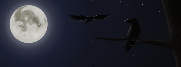
So lets start with the banner. Decided to replace that default banner with something else. I might add address of my website to some corner later.
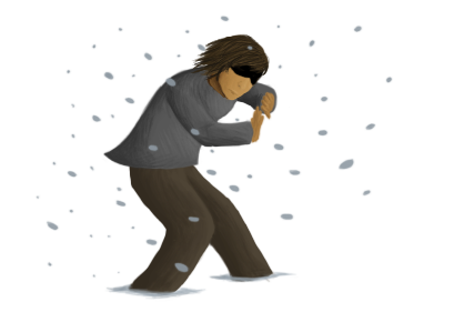
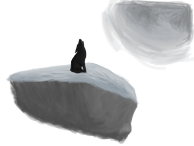
And the artwork! These both are rather quick drawings, and are dedicated to my project, which hasn't even started yet. However, it will be a sidescroll platform. I've only sketched first room and that's it so far. I'm all lost about what to start with, and I can't decide if I really want to make variating terrain or tiled terrain, since I've never done the previous one.
 And then the stuff… Umm… Well my site's progress is veeeeery slow. User registration now should work properly, forgot password can be reset and user cp works fine. PM possiblity won't be implented for a while and thus I'm wondering why the link still exists. Also, that blog works fine. I should start working on the art section next. Finally I'll just need some advertising all around the internetz.And moare stuff… I already miss 64Craft. My obsidian reinforced bank vault is incomplete, and some other stuff must be done as well. Guess it's time to go to bed. :PAnd I still need a new avatar. Dammit! Maybe tomorrow…PS. School sucks donkey nuts. Again.// And to add, I've been listening to Trans-Siberian Orchestra for a couple of days. :]
Everything looks pretty great so far. :)
Cool banner, cool art but I like the second better, and the web site's pretty good :D
Nice design on the site.
Glad you like them!
Now it's pretty much all about getting that project started. :P
Probably the worst walking animation ever! Looks more like he's trying to keep balance rather than walking in middle of snow. Well… Then it has to be used for something like that. :PLooks more like he's on a tightrope or riding a unicycle.

Now this is a bit more proper one, tho I'll need to make him rise his legs slightly more and add some bobbing.But hey, I started progressing. :)