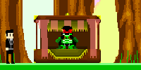
tis true, mah nigga.
Okay, now since that motherfuckin shit is out of the motherfuckin way. I've made some noticeable changes to the game today, and I wanted to see what some of you think.So what I did to the graphics was that I made them less happy-go-lucky and colorful, because it made the game look goofy and childish. I also did it because, it was an eyesore, I realized this today, when I played the game for the first time in months, so hopefully the graphics look less shit, and they won't burn your eyes out.I wanted the game to have a more apocalyptic and gritty feel to it, and I wanted to give the campaign a more desperate and hopeless tone to it, so I toned down the colorfulness of the game.Also, I remember Stevenup said that it was hard to tell what was obstacles and what wasn't. So I thought that this was the best possible solution, for now. tell me what you think.(yes I know the graphics are still horrible, these are far from the final graphics, just showing you where I'm headed with them.) :(Okay, with that out of the way, next alpha might be sometime soon. Sorry about delaying it so long, it was supposed to be originally released a few months ago(August I think). So Qwilderwibben sent me a PM sounding pissed, because he needs something for his youtube videos.[quote=Qwilder's angry ass PM]Where's mah TWE beta, nigguh? >:(DONT WORRY, HAVE NO FEAR, JID IS HERE.Also, new ideas for the campaign, going to make a certain section of the campaign have a survival horror feel to it. Which should be interesting and add more variety.Also, also, also…. One last thing, Alert's API is going pretty well, so Multiplayer for TWE is definately becoming more and more possible.Lastly, I was thinking about making a holloween themed game, or something else I'm not gonna mention yet because I want it to be a random thing that comes out of nowhere.K that's it…. So…. um…. yeah…


.png)

.png)

.png)

.png)
SCARY IMAGE TIME
LOOK AT PICTURE FOR A WHILE BEFORE LOOKING AT SPOILERlol, is that a nazi zombie from call of duty?
ಠ_ಠ
I logged in just to +1 that post.
I saw what you did there.
You should change the depth of the flames so they are above the shading, not below it..
I made it so the flames aren't visible until they pass the player's shadow, so the flames don't overlap the player sprite, which would look ugly.
But just in case, I made the depth overlap the player's depth, so if the flame ever is in the player's shadow, it would be overlapping the shadow instead of the actual player.I also made it so the fire that comes off of a victim, overlaps the victim's sprite, which someone was mentioning earlier.Pics:Sexy.