The initial beta tests have been very successful in finding bugs and making suggestions and we have worked on every one of them so far! Soon we will be adding new features once some things have been tested, so go sign up!
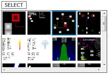
 devPortUpdates!New updates include an improved image selector which shows a thumbnail of each image in your file manager as well as telling you when a file is in use in a creation in the file manager. We hope that these features will lead to a better experience on the site.
devPort features a fully dynamic way to view people's creations through image galleries, slideshows, and instant comment updates!
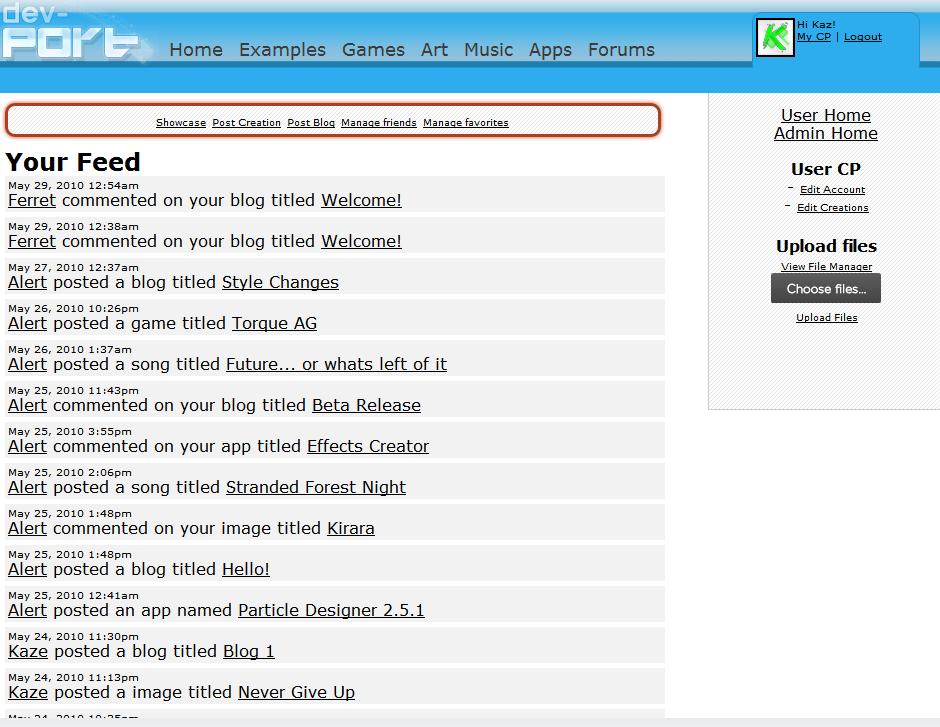
 Stay connected with your friends on the site through instant updates of their actions and any comments on your own creations through the Feed!


Its looking quite good!
The feed is really cool, you should make a system so that you know when someone is replying to you or can tag user names in your comments (i.e. @DeserFox sammich)
I was once planning on a similar feed type thing for 64digits, but I didn't have enough free time to do it.
I see you didn't listen to me, but I will point it out one more time.
@DF: Thanks!
@Ferret: Yes, we have plans to expand the feed with a few different options depending on want users what to see.@KaBob: That was the most difficult thing on this site. There's so many variables that have to be accounted for and separated, it's crazy.@XemicWhen you say padding problems, do you mean the areas where a square corner is inside a rounded corner, making it look like a smaller padding? That's been bothering me too. And that big space below blogs isn't padding, just empty cause it has a min-height. It will go away with 1 or 2 more blogs.Relating to font size, I'm not sure what you mean. How can it be wrong? It's up to the designer and the needs of a particular work.I wouldn't say it *looks* good, but nice job anyway. You should, as I mentioned on a previous blog-post, get some artsy fellow(s) to have a gander at it.
Well, the font of the navigation having the same size as a header does not make any sense imo. Just look on the web, and please tell me if I am wrong by showing a website doing that as well.
The font size of the music titles is too small; it doesn't stand out now.About the padding, yes, you know what I mean. But besides that, the padding is too narrow nonetheless: let it breathe =DThe top menu looks a bit off to me. Maybe a font switch or a font colour switch?
@Mordi
I don't want it too artsy since I don't want to detract attention away from the content of the site, which is the user's creations. Nonetheless, we are doing our best with the suggestions we are hearing.@XemicAh, that makes sense now. Thanks for the help. I'll work on it tonight or tomorrow since it's my days off and I need to relax a bit."Well, you set the min-height to the outer container, while it would make more sense to set the min-height to the inner container. "Good point, didn't catch that.@MeleeHopefully Xemic's suggestions will fix this issue.@Kaz: Poor choice of words on my part. By 'artsy' I meant 'design-y'. Someone that knows what works with what and where, making for a more aesthetic feel to it all. 64digits has a pretty good layout and design. It's minimalist.
I'll stop nagging about this now.