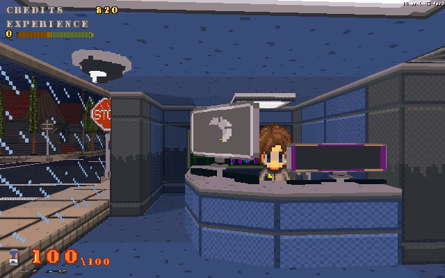
Well after managing to score some time to work on things, I managed to nearly complete the male npc model. I decided to take a different route then when I firsted made the model and instead of building it off one object and composed it of several.
The model is broken up by moveable pieces, upper/lower arms/legs, hands/feet, head & torso. Basicly its set to move without any bones. Now the animation will be frame based, however U3d supports a vertex tweening which is supposed to fill in the gaps between movements. Now I'm not 100% certain how this will work with the model I've constructed, but hopefully it will work…but its also not a must for their to be smooth animations.It'd just be nice.I've also decided to drop bump mapping for its normal uses and try using for other things like special effects and possibily water too. I'd sacrafice refraction for a more controlable water effect anyway, as reflection will actually be fairly easy to apply.Other changes I've decided to make is dramaticly reducing the draw and fog distances. Mostly because then I can have more on screen details without dealing with background stuff. But who knows, I'm still playing around with things. I am happy with the basic visuals, it'll definatly look nice and artistic to make up for it not being realistic looking. Whats with realism these days anyways? Isn't that why we play games, to escape it?
Nice cel-shading, but try keeping it consistent with the other objects, such as the pillars.
I could retexture map the objects so that they would support the fake-shading overlays but currently they're only set up for regular textures.
Oh man, I want to play Ocarina of Time again!
nice
the model is okay looking, it needs some anatomy fixes…the rest of the game looks good though, other than the obvious seams between floors and the brick wall to rock wall behind the furthest model.
Kickass, but the head is a bit too big.
Reminds me of Oblivion. Seamless floors pretty pleases?
That's a good point about realism. Everything wants to look realistic. Everything is going to end up looking exactly the same. It's a good thing there are games like Team Fortress 2 to show that people should stylize. You have a huge number of possibilities. Why stick to one?
Realism in game graphics doesn't have to result in a lack of style. What's not stylistic about Portal or Half Life 2?