Mock screenshots that is.
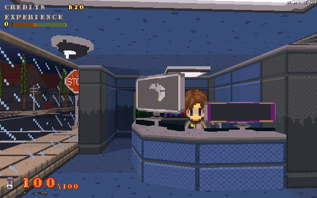
Althought it would be nice to actually display them, I'm just going to have to spit out some links.http://64digits.com/users/Scott_AW/mock_combat.jpg Now redone as of 1/25/08 They're not in-game screenshots, but mock-ups. So the background and the enemy are just background for reference.I've been playing around with those two interfaces for a few days, time permitting, and I'm semi-satisfied. Theres more to add to the combat screen, but when a fight starts it will look something like the mock_combat screenshot.As for the spell book, I decided to couple the techniques and combos with it. Techniques are different styles of fighting that you can learn, were as combos can only be achieved if you have party members like NPCs or fighting pets.The part in the tech/combo box that has the abrivation "Con." stands for condition. Certain techniques/combos require certain conditions for them to succeed. Right now I've no list of conditions worked out, but it will be varried.For example, lets say you have a technique call "Long Swipe", now the ability of this would be to hit multiple targets at once, thus the condition would be that there is more then one opponent.In the spell box there's "Dur." which stands for duration, which can be in minutes or turns. A torch light spell would be based on minutes, where as a poison spell would be in turns. "Pwr." Stands for the strength of the spell, it also will update when the player's skill level exceeds the spells required and thus increase the power. This works in reverse too where if you were to attempt to cast a spell that is higher then your skill level, and you have the mana to do so, then the power would be crippled.
Looks nice! Thought, it'd look more logical, if you move that "Attack, Items, Escape, Spells, Tame" GUI piece to the left and compass piece to the right. WASD keys are on the left side of keyboards.
But it's not big deal.Sexy.
I like the buttons, but change the font.
I couldn't find a font to properly replace the old ones on the tabs so I just made it fancier. And I liked stampede's suggestion and went and flipped the compass and combat gui's positions.