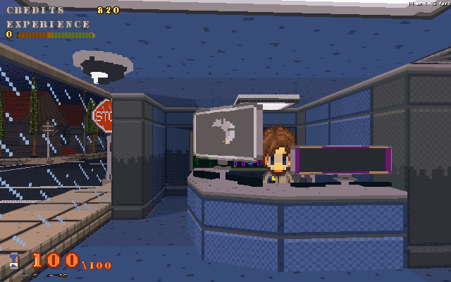
So to get some feed back, I put out Black Shadow onto Game jolt. I've revived the project and am going to do all new levels of a static size unlike before. The current version available is the last one I released with some small fixes and additions.
http://gamejolt.com/freeware/games/platformer/black-shadow-build-29/1179/Now the general opinion is aside from a lack of story/intro and basic menu function, I generally get comments about the controls.Of course no one really elaborates what they mean by that, since control is a pretty broad area in gameplay. That and when you play test your game you tend to ignore certain irritations caused by control issues.So 64ds, what needs to be fixed about the controls? Buttons usage, general handling or something else? Please be specific.
ok well the controls are fine but it's hard to tell where teh walls and floors are but after a while you get used to it… not that someoneelse will. also you the background scrolling is not supposed to move faster than you move it is supposed to move slower than you move (unless that's how you meant it to be the game is intersesting)
also the game is kinda hard until you get the hang of it.Thats more like it, thanks for the comment.
Music is rubbish, parallax scrolls far too quickly, needs some snazzy graphical effects when you kill things, it's hard to tell what's a platform and what isn't, the tiles are terribley boring (needs more variety).
Now then, the controls - jumping is hideously unnatural. If you hold down the jump button, you bunnyhop which is an awful flaw in any control scheme. The turn-around at the top of the jump feels like you're hitting a solid ceiling rather than gravity taking over. Speaking of ceilings, sometimes you can't jump underneath a low object and sometimes you can - it looks as if you've got your jumping collision check mask set too high.The water (and getting out of it) seems inspired by the classic old game "ET".
@Cesque - Never played the ET game.
@Juju - Oh its so harsh, but its useful. I've been sitting on these tiles sets for over a year, it does need some more variety, and the caves are a good example due to the collision issues they seem to be causing. As for the music, well at least I didn't make them, didn't think they were that bad, but you are the music guy.So some cleanup on collision, cleanup and rework some of the player code. I think I lost track of some things that needed fixing since I lost a version awhile back that included a bunch of additions a fixes, so I'm starting from that last build and working up from that. Additional effects in attacks and killing of enemies is a good idea, maybe chunks and sparks flying or something.Again, thanks for the feedback.I meant the way you fall into it and then need to wait to get out is ridiculously slow and annoying. :P
I didn't find controls that bad - didn't try dodging much, but first I assumed it's some relatively useless dash. The third room of the game me biblical amounts of lag.Oh, that mud not water. But I should speed up the sinking some.
Yes the dash/dodge needs reworking to be useful.And for the large rooms, well I'll be redoing them in 480x480, previously they were 640x640 and 640x1024 or 1024x640 for the large ones. I experience lag on my netbook, so I figured consistent and smaller level size will help.