Figured out how to do the shading, now it fades much nicer.
Fire smoke also has been changed, it starts out black and turns white.The explosion is a random assortment of black, red, orange and yellow color smoke that gradually shifts to gray. The colored ones darken to black and then shift to gray as well.Cannon balls still roll along the ground, but now they don't roll across the open chasm, for some reason they did.Oh, and bowmen are sneaky bastards.
Fact: I had to watch that twice to find the bowman
splash damage?
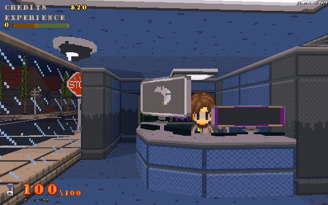
nice.About this and the other vid: I like the explosions, but I really don't find the blue texture of the castle wall appealing. Most of the time you the outside of the fortress from a pretty far distance, so I think you should increase the size (and lower the detail and/or contrast) of the texture, because it ends up looking like TV noise in the Build engine graphics.
Yeah, its been kind of bugging me too, I even changed the colors so it was less contrasty. I think I should make the blocks bigger, maybe add spacing.