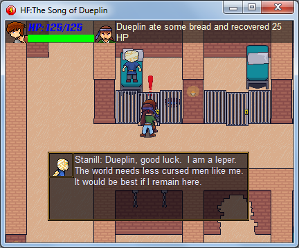
There usually comes a time in every game progress when you ask yourself if the control scheme is correct. I am at that phase. I have been working on the examine system for the game. When you approach something interesting a '!' will appear above your head, you then press a button and can examine it. In the first dungeon this can be used to talk to prisoners in their cells. See below-
 But I currently have this examine control to CTRL and to read through the conversations you press space. I KNOW this needs changed. What's throwing me a bone in this lot is that Space is the bottun for attacking. Normally I would set the attack and examine/talk to the same key, but this game is different sense you'll be moving quite a bit and it would essentially mean you can't attack if you were standing on a place where you can examine something.So what do you guys think?I'm thinking this-Arrows=WalkSpace=SwordCTRL=Examine/Talk/Read Through ConversationsEnter=InventoryShould I use the class Z & X format perhaps? Input is much appreciated!Also, I'm looking for a music composer. I'm thinking a soundtrack that would be a cross between 'The Last of The Mohicans' soundtrack and Ronnie James would be ace :) Actually that mashup is giving me goose bumps already!Beta should be out soon BTW, I wanna finish the prison level completely. And all I've really got left is the boss battle!
Toast, do you want to be my children's godfather? I don't have much faith in religion but I feel you'd be a good influence.
A shining example of British masculinity.
Ahaha, I think it's mainly me who doesn't read comments.
What you guys don't like Spacebar?! Space is large and in charge! Well I'm really thinking the Z & X format, but I'll have to check how it works with foreign keyboards. Sorry to exclude people but I really don't know how many German people will be playing my game XD
Solution: testplays. Find someone who will play your .gmk in person, so you can get a live feed of their reactions. (If you can't find anyone around the house, bring it to school or whatever as a semi-workable executable on a flash drive.) If you hear consistent complaints about your controls, fix them appropriately.
Don't worry about AZERTY keyboards etc unless you actually plan on releasing this worldwide, and for people to actually play it in different countries. It's better to just move on to other things before you get stuck on something so banal.Sidenote: that laser-blue Health Text makes me want to stab my eyes out. You don't need to physically write "HP:" on the bloody thing; if they can't figure out that number's going down with the health bar, their IQ probably isn't high enough to understand the concept of pressing buttons in the first place. Move the numeral text down onto the actual health bar, and make the text like white or something, whatever contrasts most against the background of the bar.Sorry, it just really bugs me when people make great games but fuck up their HUDs and make people wish blindness upon themselves from a simple screenshot. The graphics themselves look nice; it's just the layout that sucks.And while you're at it, grab a dictionary.
Canundrums #doesn't equal# ConundrumsI ended up making it to where the game keeps an unencrypted save file just for the controls so the player can hand-edit them.
Because fuck control changing menus.Panzermancer: This will be in .EXE actually. I use MMF2, so the editable game format is in .MFA
I think I might put a heart next to it instead of HP, and that green bar isn't a health bar it's an energy bar, it's completely unrelated. Also, the text changes colors depending on your HP level. I think I may make it contrast from Bright Red, lowest, to white, highest.Juurian: Alrighty, capp'n! Changed! I hope the Spelling & Grammar Nazis are happy now