Vagabond P.I. in
The Valley Of The AncientsAlright, so I started that project title 'Song of Dueplin' when I first got on this site. But I kept having another idea just gnawing at me (nom nom nom). So I decided, that it wasn't too early to do another idea instead, and on the 15th I started something else called 'The Valley Of The Ancients.'My goals for the project include-* Complete a full story arc* One that people will enjoy hopefully* Integrate several different gameplay types even though the battle system will be unchanging* Make the entire game almost all, if not all, mouse controlled, something I've never done beforeAnyway, betas speak more than text so try ithttp://www.mediafire.com/?avrqrasf6423b7qI'll let the beta do the talking, but here's a few screenshots anyway. Keep in mind these are beta screens, they are subject to change.Included in beta=

 Level in development, not in beta


The game closed after that third screenshot, so I take it that was the end of the demo. It was good, pretty solid and an interesting enough story. Just a few things you should change: the color in that train is really damn bright, might want to tone it down a bit; there's a couple spelling errors and I'm pretty sure Professor isn't shortened to "Pr.", maybe "Prof."?
Also this is rather good for an intro, I just hope the full game's reading/gameplay ratio is more evenly balanced, or tipped in favor of gameplay.Pretty sure Sarah's surname is FimmThanks Charlie. And yep, that was the end of the demo/beta. I'm pretty sure I'm gonna change the train interior because it sees to be bugging quite a bit of people. For some reason I always saw professor abreviated as Pr., but who knows it could be a regional thing, but most likely I'm just wrong.
This being the introduction does include an overwhelming amount of dialogue that won't be dumped on players otherwise. While I wouldn't say that the game is tipped toward gameplay in oppostion of story, I will be trying to get a perfect 50/50 balance.EDIT:Here's the revised train interior-Before=a world of difference
doesn't really look too good…
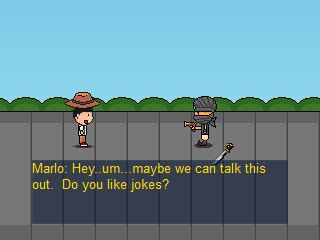
… but i think i have some advice (maybe). for one thing, the sand texture is awful, just a few dots scattered around? that needs to be changed, add more colors and let the texture repeat more often, the pixels are way to big. a pixel on the floor right next to the player should be about the same size as a pixel on the character sprite. speaking of that, it needs to be a little smoother to fit in with the rest of the graphics. i'm thinking just changing the black outline to a selective-color outline would do wonders.also i'm having trouble figuring out if this is supposed to be a 3d game or a 2d game. (or a 2.5d game?)i do have one compliment, the inside of the train looks decent, however it might be easier on the eyes to darken those colors by a small amount. (maybe show some shadowing based on the light coming from the windows)p.s. the dialogue is looking funny lol. (mostly because reading it out of context is weird)Well the bottum two screenshots have been ditched for a different level set up. The actual game was 2d, but the bottum screenshots were for a possibile map setup, it was going to function similair to the map screen from Final Fantasy 6 if that rings a bell. But I've decided to go with a better more conventional of sorts setup. It was because of the fake 3d extension, Mode 7, I was using that those pixels were looking so big. But I decided to ditch that idea like I said.
And honestly, try out the beta posted if you wanna see how the dialogue actually is, it is in fact more humor orriented.