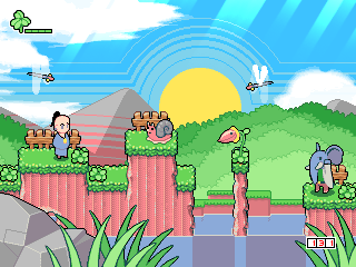
I thought I'd try a similar approach to parts of Yoshi's Island and Yoshi's Story, by making the cliffs sort of look like they were constructed out of old tattered and ripped corrugated cardboard.
As you can see, while it doesn't look too bad, it doesn't fit in at all.
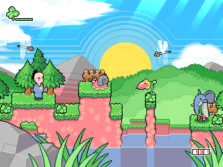
So I went back and did a simpler version of the first attempt.
It looks perfect, you can even see I added some extra anti aliasing to the trees, along with a secondary tree behind Twinsen.
I'm still not sure about the grass though, I definitely don't want to keep the same droopy grass we have now.
But this grass looks more like the top half of a hedge, rather than the grass growing down the sides.
Now I'm thinking I should re-tile all the levels with these new graphics, I could probably knock it all out in one day if I had the set completed, and it would definitely be worth the extra effort.
And no, Cocopuffs still isn't back yet.

Today
GameTrailers started a Metroid retrospective, their six part Zelda retrospective was very good, and the firts 2 parts of their Final Fantasy retrospective is good too.
But as you should all know, I'm a big Metroid fan, so I'm really looking forward to the rest of this retrospective. You can check the first part of this retrospective
here. 
P.S. 4,000 hits.

BYAAH!


 Today GameTrailers started a Metroid retrospective, their six part Zelda retrospective was very good, and the firts 2 parts of their Final Fantasy retrospective is good too.But as you should all know, I'm a big Metroid fan, so I'm really looking forward to the rest of this retrospective. You can check the first part of this retrospective here.
  P.S. 4,000 hits.
  BYAAH!
Very impressive. I can't wait to play.
Oooo. Tiles look different simplified. It's good in some cases, but some things I don't like about it. But then again, I'm a dither maniac.
Awesome.
Awe-gasmic.
You suck at graphics.
<[blk]/extreme sarcasm>That looks so good; it is not even funny =/