So I figured I should keep this blog going, today I'll write about why I made some of the changes to my game Occultus Command.
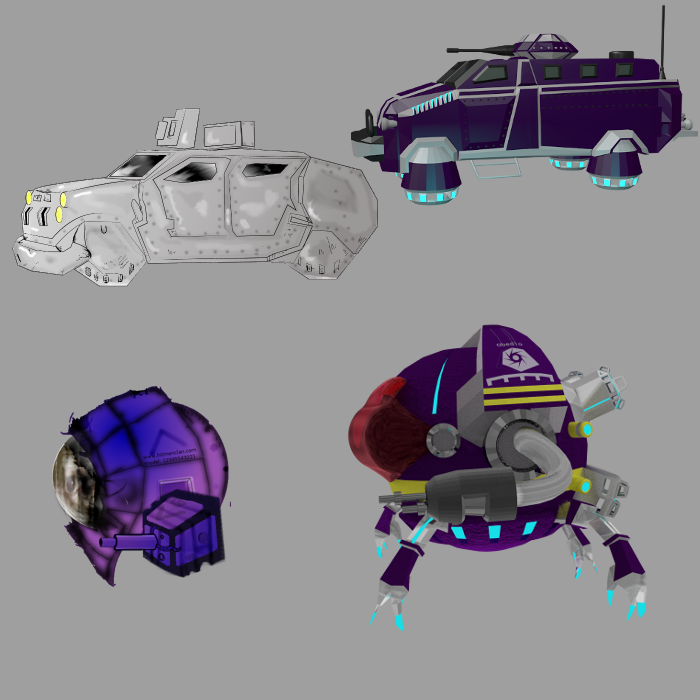
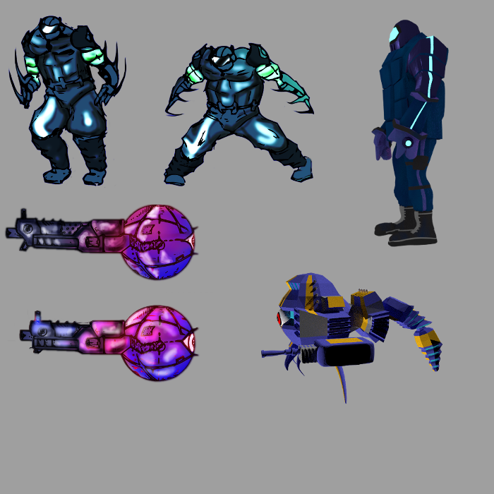
So, here is a picture showing changes to two of the bosses from the Demo and the bosses I have and am currently working on the new game: One of the big complaints I received from the first demo was that it was hard to tell what was part of the game, and what wasn't, so I've decided to remedy this with color and by keeping the design more consistent, so enemies look like they all belong to the same level, with similar color palettes, while the main characters stand out more from enemies and also the levels and platforming. The player will essentially know what is or isn't friendly by color and design.
  Although I will admit, the new graphics do seem to have less personality than the drawings, once you see the game in motion the animation more than makes up for it and the more uniform look as well. Things look like they are from the same game. The next major change were the characters, soooooo many people complained that the female cyborg looked like Satsuki from Kill la Kill (btw my game was before the anime, but I get it), sooo I changed her color to match the palette design as stated above, and I changed her design to look more "techno" like. Again, some personality is lost from 2D to the new design, but ease, animation, consistency outweighs the cons IMHO.
  Anywho, I hope once ya'll get to see a trailer (sometime in February) the changes will make sense, also the gameplay was simplified, streamlined and in other areas sped up as well, but that's talk for another blog.
Looks really neat :o