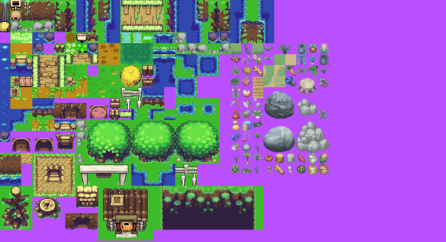
These are modified from the last tile set. They also include Harvest Moon garden sprites/tiles. The Harvest Moon tiles took a long time to rip.
 Changes: The grass is darker, the rocks are gray, river rocks are dark purple, trail is darker, the cave and cliffs are darker, and a lot of small changes.
Only problem with the HM sprites is that they're a little less bright than the Zelda ones. Other than that, looks like a good tileset. I'd use it.
yeah, they look dull looking
looks awesome. The door on the bottom has a bit too bold of an outline
Agh. As a long-time Zelda fan, I've gotta say that something about TMC really threw me off. The sprites are great and all, but something about it just rubs me the wrong way.
I liked MC graphics. Except the trees. They seemed too short.
This looks even worse than the original tileset!
…Or I just don't like the dark tint. :3Are the tiles on the right also from that game? Doesn't look like it.