Currently, the squares game is 75% complete. The end is almost in sight and all I have to do is design a few levels, the final boss fight and the final ending. I still intend to add extra features like online leader boards, hidden content and achievements, but first get the main content out of the way first.
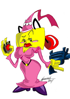
A few weeks ago, I thought it would be a good idea to replace the current poster I have of the game with one more polished and professional looking. So I shopped around Deviantart and ran into a guy called Manos, under the user name SuperManosBros. (http://supermanosbros.deviantart.com/)We got into some talking and he said he would help me out with the new poster. This guy has one of the most exaggerated art styles I have seen in a while. His work reminds me of something from Beano or MAD magazine. I asked him to redraw my characters in his style and I got back some of the wildest versions of my characters to date.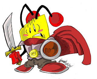
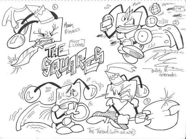
 So with Manos' artistic talents I got a few draft of the new poster.
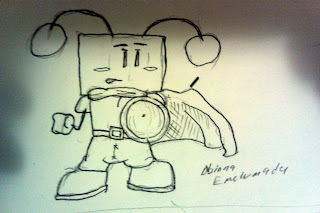
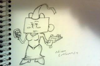
 After some careful thought, I decided to get the best parts of each draft and combine them to form a new poster reminiscent of the old castlevania game. The resulting draft looks something like this (sorry I dont have a scanner).http://1.bp.blogspot.com/--q3KTmxPUhU/Tg6SDdXHXyI/AAAAAAAABL4/j_mECajpHCA/s1600/IMAG0004.jpgI expect the full poster to have much more detail as well as a nice color palette. In the mean time, I better get that game finished. It has been a long road but it is almost over. While we wait, enjoy these pictures.1. My version of Manos' Kyle
 2. My version of Manos' Lana (Decreased the bust a little)
 3. The most deceptive Clint Eastwood poster ever (This is not a post-apocalyptic movie)
Very cool.
I don't think the poster is that post-apocalyptic. Everything is still modern. Bus, building, clothing. Also it's by Frazetta so it's great anyway.
Orange skies and half-naked women make everything Post-Apocalyptic.
I agree with JuurianChi, then again I have been watching a lot of Fist of the North Star so you tell me.
You should get him to do in-game graphics as well.
To be honest, while the squares in-game look rather cute, the more realistic version of the princess looks horribly disturbing.
@Cesque (ROFL)
That is NOT going to be in the game!!NOT! GOING TO BE IN THE GAME!! (lol)I asked Manos to draw the squares in his style to see what he is capable of. He is from Greece and the exaggerated cartoony style is very popular over there I used to read a lot of Beano comics when I lived in the UK).(Closing comment: NOT!)Good, just saying :P