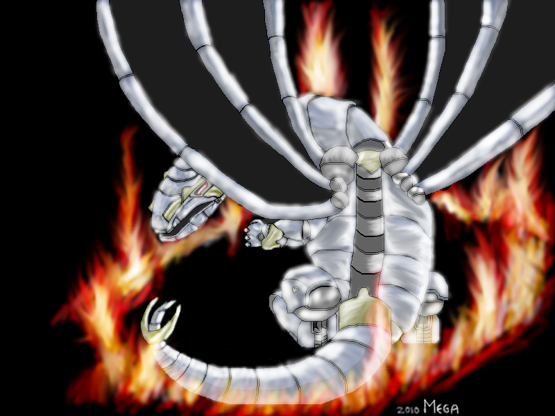
First, some art. I drew this in stages for about four days.
Much coffee was consumed, and many backup-copies were made. Besides that, I have updated CyCore somewhat. It now has missiles, better bombs, instant-death-spikes, indestructible turrets, the ability to die and a load of annoying tutorial messages. Enjoy.http://64digits.com/users/Mega/Cycore_1_2.zip
It would have been nicer if the pixely lines weren't so… pixely, since the rest is so blurry.
Yes, the blurriness is hurting it, and it could use more contrast in areas to show more form, or differentiate between parts. It'll help it look less blurry too.
I'm thinking of doing a recolor, when I have a spare 30 hours. I'll see what I can do.
Other than the blurrines mentioned, it looks good. =)
I don't like the untextured wings..
http://t3.gstatic.com/images?q=tbn:kNHnMS0ogvLZOM:http://img69.imageshack.us/img69/8562/batwingqw5.gif&t=1http://schmidling.com/bat1.jpgThe game was nice.your dragons are everywhere >_>
anyway this one looks a lot better then the image at YYG. i guess this is the original resolution?i don't see what people are calling "blurry" i'm just not seeing it i guess 0_0 the lighting does have a bit of a glow to it but overall i can see the shaded colors and there aren't many, they are solid as well. maybe my definition of blurry is different lol.overall looks very nice, only thing odd is the wings like i mentioned before =P