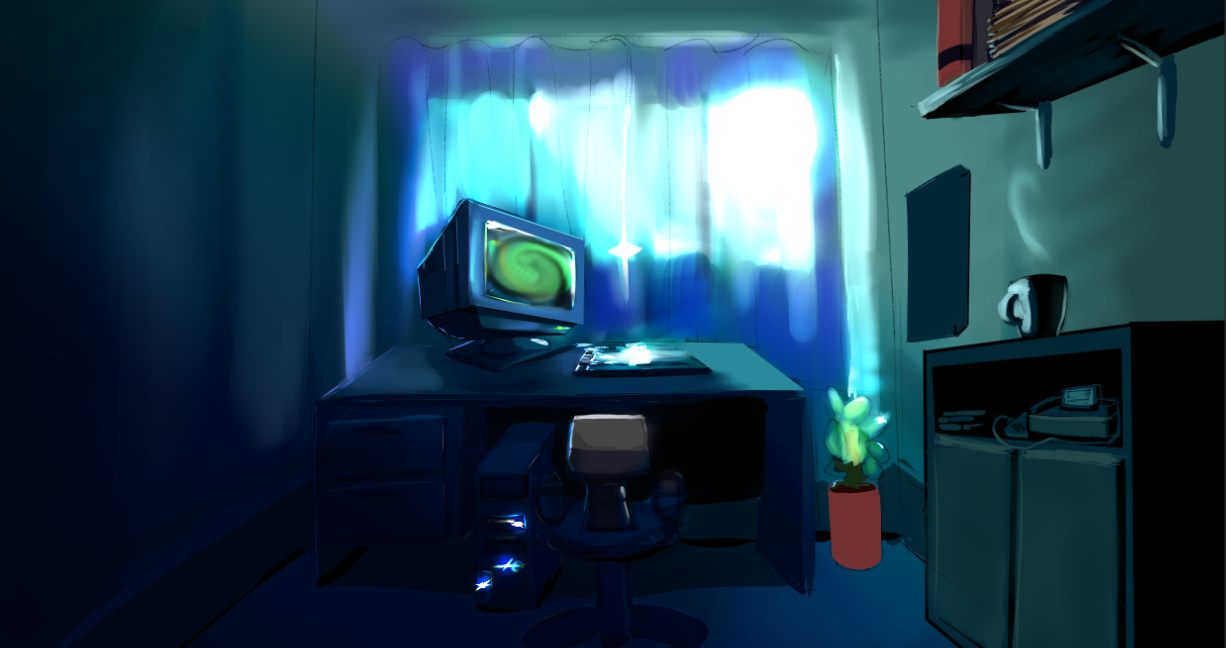
Anybody remember the Realtime Roguelike I was making? If so, you get a free cookie later on in the year.
Anyway, I had to redesign it. See, it turns out I managed to get a facsimile of the original idea running in Game Maker, and… it sucked. Basically, imagine a low-end ripoff of Daggerfall with too many options (Like a Roguelike), and you've got it… so REDESIGN! It's kinda from an oblique perspective, and it uses 2D characters (Because to be perfectly honest, while I can model great swords, space-craft and fireballs, I suck at modeling anything organic/humanoid).So, I'm first of all following the maxim of game design: Remove everything you don't need. Hence the simplified graphical style.Next, once I have the core game ready, I'm going to follow the maxim of Tarn Adams: Stick every damned thing you have into the game until it can't hold any more, then double that (Roguelike rules).Also, on an odd note, I downloaded the Minecraft update… and got bored after finding a wolf. So I am instead playing Dwarf Fortress.Finally, a bit of South African humor:
I agree with steven, that is a very nice artistic style, it could turn out to be quite neat.
I feel bad working on something that uses the same render style…
But hey yours looks better.The art style reminds me of other games with pixel art 3d graphics, such as GO GO MARINE SQUAD!, DOOM, and Minecraft :P
Also, you're South African?I'd play that.
I'm working on migrating it to my C++ engine. Got the prototype more or less done.
And yes, I'm South African.It looks really good, I really like the art style! :)