diggadiggaboopboopCredence Filter is was horribly inefficient. Previously on the low-end machines in my house I got about 14fps at max graphics, 8 on my laptop which apparently is the shittiest thing in the house.I devised a stress test wherein lights are created on screen every step until the framerate drops. Using this I was able to pinpoint the least efficient aspects of the engine and fix them.
 (This test currently gets ~130 on the same pc)It's hard optimizing something with so many drawing functions, one small change and you get something like this
 or this
 Eventually I was successful. I managed to bring the framerate up to 60fps on all the computers (except my laptop) and implemented a frameskip option for anything too shit to run it at 60fps (like my laptop), as well as a dozen other graphics options.Like if bloom isn't your thing, you can shut it off and reap the benefits of a slight increase in framerate.Also I made a cool thresholdy filter to reverse the floaty-ness of the light engine.
 Let me know what you guys think of it because if people don't like it I'll remove it or make it an optional setting.Personally, I think it's nice and it interfaces with the static in a really cool way.In other news, I tried my hand at databending images. (don't worry, these aren't the databent files just pictures of them.)Here's the original:
 And the glitched ones:


 All I learned from this is that there's a logical and consistent way that databending breaks images depending on the file format, which just makes the whole thing less interesting to me.Also I made some logos.
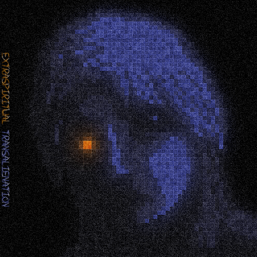
 They don't look much like it but they are entirely pixel art there's no blending or post-processing or anything.Also I started a new album of weird asymmetric electronic nonsense.
 clickableAlso I made nothing else.Tricked you.
 Previously on the low-end machines in my house I got about 14fps at max graphics, 8 on my laptop which apparently is the shittiest thing in the house.I devised a stress test wherein lights are created on screen every step until the framerate drops. Using this I was able to pinpoint the least efficient aspects of the engine and fix them.
 (This test currently gets ~130 on the same pc)It's hard optimizing something with so many drawing functions, one small change and you get something like this
 or this
 Eventually I was successful. I managed to bring the framerate up to 60fps on all the computers (except my laptop) and implemented a frameskip option for anything too shit to run it at 60fps (like my laptop), as well as a dozen other graphics options.Like if bloom isn't your thing, you can shut it off and reap the benefits of a slight increase in framerate.Also I made a cool thresholdy filter to reverse the floaty-ness of the light engine.
 Let me know what you guys think of it because if people don't like it I'll remove it or make it an optional setting.Personally, I think it's nice and it interfaces with the static in a really cool way.In other news, I tried my hand at databending images. (don't worry, these aren't the databent files just pictures of them.)Here's the original:
 And the glitched ones:


 All I learned from this is that there's a logical and consistent way that databending breaks images depending on the file format, which just makes the whole thing less interesting to me.Also I made some logos.
 They don't look much like it but they are entirely pixel art there's no blending or post-processing or anything.Also I started a new album of weird asymmetric electronic nonsense.
 clickableAlso I made nothing else.Tricked you.
I love that last bit of album art.
I like the threshold effect you have but I also like how it looks normally, couldn't decide which looks better. On one side, you get a little more detail in the lighting, and on the other, you don't see that awful circle gradient that most people make their lights with.Also, I'm disappointed to see how many +1s this is getting with no comments. Come on guys, surely you have something to say.I like it with the threshold filter. It looks awesome.
Good job on the optimising, too. It can be a long process, but it's so satisfying in the end.I love that threshold filters/effect. I've spent a considerable amount of time implementing them in 3D for various games (Via SweetFX) and for my own engine.
And that is some high-tier pixel art. Looking very good. That album art of yours is causing a Moire effect on my monitor, which both draws attention and made me think it was animated.Effects look good. Looking forward to some more filled gameplay and scenery.
I like the last databend.Seems like a more difficult way to do something you could do with simple effects in GIMP/Photoshop, but to each his own.Making music is always fun for me, but I'm definitely not delusional enough anymore to consider a serious foray into that industry just yet… maybe after a few successful games I'll dedicate some years to an adjacent craft but game development has my energy until I achieve my own self set heights. Good luck, homie.I like some of this, I dislike some of this, but I'm glad you're posting.No sarcasm, I'm not from Wayofthepixel. :P
Also, I'm very specifically referring to these:Ah, those are simple as hell, the body of them being comprised of a base color and a single darker color to smooth edges in an unprofessional way.
I'm glad you like them though, I like them too.EDIT: I just realized I lied about there being no effects on these; I put a subtle, Game Maker color-change animation on the Credence Filter one. My bad.I love your art style. It's looking very nice.
Note: I was really just talking about my music - yours has some good potential. Needs some musical foundation work but there's some gems in there.
I'm keeping up on Credence Filter since it looks like it could easily be a game I'd love once you flesh it out.