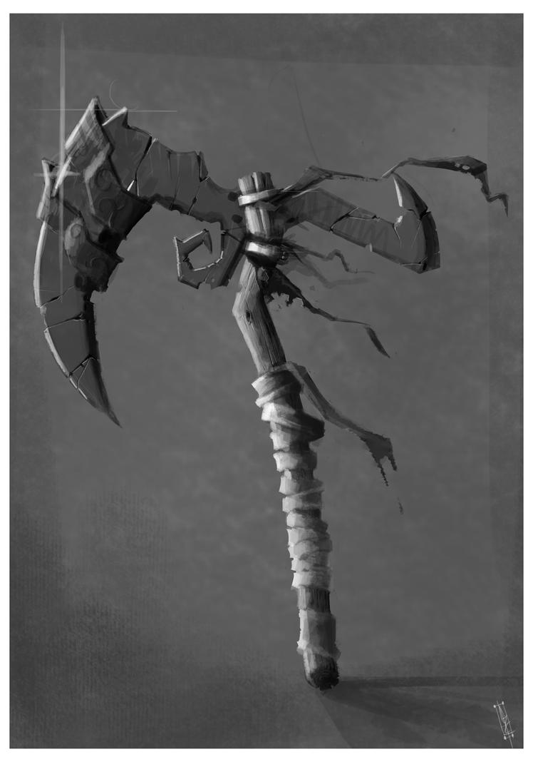
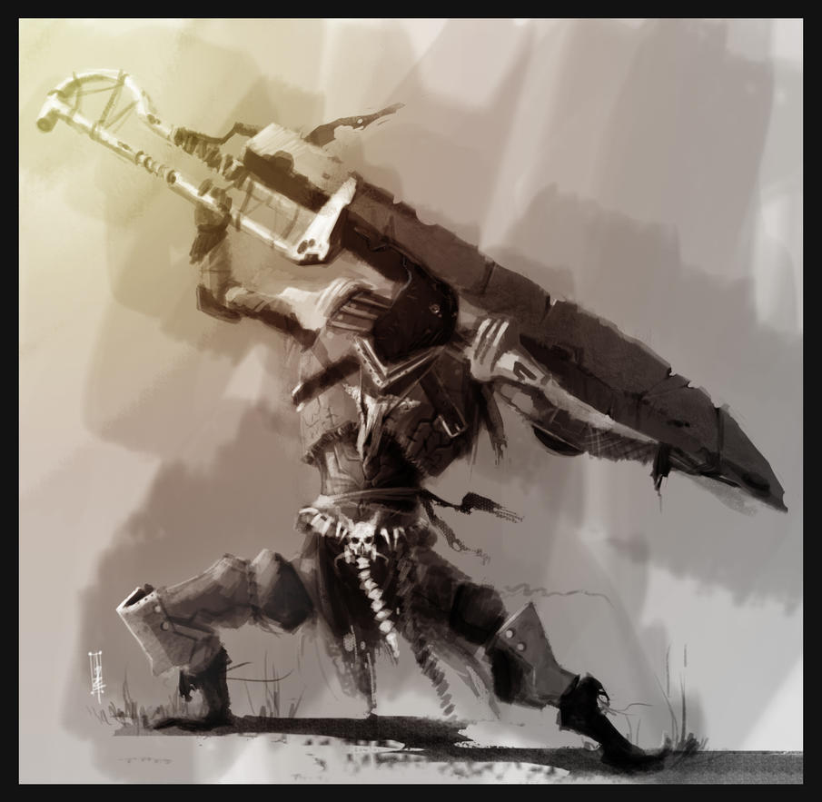
"watch my SUB-Zero finish 'em!"I had another one of those depressive periods a few days ago, but this time I didn't let it put me in a headlock and pull me into another art block.Instead I fought back and said 'yea? I can do even better, you'll see!'Which turned out to be a really good idea.I needed to make myself more presentable in an 'i'm a professional' kind of way, as I didn't feel I belonged with my silhouette style. I either felt unique, or out of place.—FIRST OFF—I just updated my online portfolio. If any of you guys have the time to look it over and tell me what you think about it, that'd be awesome.http://gunzet.daportfolio.com/—-NOW FOR ARTS—-As you can see, I've changed my style quite drastically once again. I don't think I've spent less than two hours on any of these, and it's a total pain.


These are wondrous.
I'm loving the ridiculously impractical weaponry, as well as these floating demon heads. Number (2) is the coolest, IMO.Your portfolio is very impressive. Don't give up on the silhouette style, it looks so cool. I mean, obviously stuff like what is in this blog is more professional looking, especially for a concept artist, but the silhouettes could still be good for when you want to dick around and just draw something, or as preliminary sketches before a bigger concept piece.Sorry about that rambling run-on sentence.Nice new style!
The second picture, with the ridiculously high powered, visible, red lasers, is really depressing.While you are really good at this and I love your concepts, I can't remember any picture coming from you that looks really finished and I find that unfortunate.
Basically everything you show looks concept-art-ish, while it seems like you are perfectly able to make a polished scene with lots of crisp detail. The second picture would look way more awesome if you made it less sketchy, imo, for instance.@Charlie: Haha, madness is what I do best. And #2 is also my fave, had fun working that jaw and rounded face over.
Also yea, I'll hold on to the silhouette style, cause I really did/do have fun with it. But I just need to dedicate myself to this for a while. Sometimes people don't know what I'm capable of. I feel I have to prove them wrong once in a while.@FSX: Lmao, the lasers. Yea they are SUPER high-powered, that's mostly cause I put an outer-glow effect on them and just got too lazy to make them less noticeable. As for the depressing part. Do not know if good or bad, do not care cause I honestly hate that pic. I think it's too blurry and just… uninteresting.@Sirxemic: To be honest, finishing pictures isn't something I enjoy, and that isn't a cop-out, I just really don't enjoy finishing my work. I am indeed a concept/idea artist, and that's just what I love to do. The technical side of art such as style and execution always comes second to me as I focus on design and 'character' more, which is just preference really. A lot of concept artists now are more illustrators than anything, and there's a big difference between the two.So you can say I just really love eh, bringing ideas to fruition, rather than whole scenes. Me drawing something like the second picture is pretty rare, and I'll agree it could be loads be sharpened up. It's really blurry and just… I hated it all the way through. But I guess that's what practice is for, which is exactly why I painted it.Also thanks mang.These are so freakin impressive.. I especially love the first one. The axe.. scythe.. thing looks amazing!
Love your artwork.