[9/15 2:43 am]
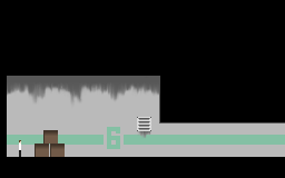
Mock Up:Actual size. Blown Up to correct resolution. (right click and view in other tab for full blow up)
 Edit: I forgot to keep updating this, though to be fair the visuals haven't been changing much lately.[10/21 12:32 am]First Screenshot(resized)
 I have a lot more done than is shown here, but I have a lot more to do… wish me luck.
That's an interesting style you're going for there, Ferret. Reminds me somewhat of Iji/Aeronuts/<somethingIForgot>.
Just one recommendation: Color that smudge that overlaps the green stripe a little greener. It'll help the effect a bit.Thanks ^^ Actually it already is mixed in, but I do plan on using some more transparency. Also those boxes are ugly and will certainly change before I'm done.
Unrelated (but I like how you censored your code), but YOU WENT TO COMIC CON?!
You're supposed to be a reporter for 64D or something. Write about your experience.That was only if I went under 64D's name :P (things didn't work I guess)
I went there as "Priscilla Cifra" (because badge swapping).