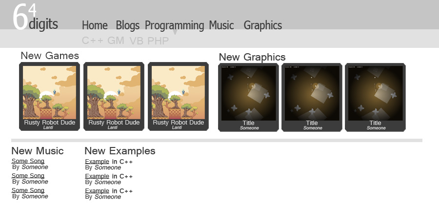
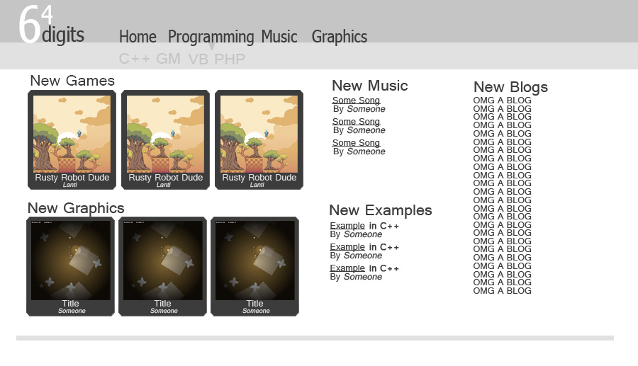
So as some of you know, a group of us have talked about re-doing 64D so it can accommodate our many skills that we have developed over the years and that have moved us away from Game Maker. Since I'm going to college for web design and am one of the few that have the time/ambition to start such a large project, I guess I'm leading the project haha.
I've talked to a few people and have gotten some input on what the new site should have and I tried my best to show these concepts in design-only form. FYI I stayed at my friends house and we played COD4 all night so I'm pretty tired and it's not my best, but it's decent. Also there's no color scheme because I suck with them and it takes more time than I had to do it. I'll see what I can do during the week.Obviously, please tell me your thoughts and improvements. I am only 1 person. Log in will be on top-right FYI.Design 1 Problems:Unnecessary blog link in the navEmpty bottom spaceDesign 2
 Problems:Blogs on left maybe?Questions:-Will the site be a different name?-Will we still focus on games?-Will there be feeds for friends? (probably if the site expands far beyond this site)-What the hell else do you want?-Badges?For those willing to contribute ideas:Remember, we will have many different things (music, games, graphics, etc), so we need an easy way to navigate between them all along with their sub categories. The navbar I created will allow sub categories and easy expansion if we ever have to. If you can think of something else, please share.For those willing to contribute skills:If any of you want to help create the site, please tell me. This is a large project and it will take a long time to create it on my own. I already know a few are willing to help me. I will need people who are good with PHP, MySQL databases, and javascript(preferably jQuery).I have my own server and will create access to it for those who are helping when we get to that point.Next design ideas:ETA middle of week-Split languages into Games, Web, Applications and have a separate Examples page-Keep forums-Keep favorites-Top downloads/Highest rating of each
Why not simply move to categories of creation (Web, Games, Applications, Video, etc) rather than just adding languages? Otherwise you'll have to keep on adding and adding for that guy who uses Python/Flash/ASP/LISP/Whatever.
Good point FB. I like it.
(could be a kinda touchy subject here but)
i kinda like the blogs on the right actually… maybe have the login above that on the right(not to be exactly like 64D layout, the preferences and such could be elsewhere, while main profile name, logout, messages etc will be there).different site name? yes. this is seperate, can't call it the same but can be similar. (imo)still focus on games? I'd say so. its part of programming. HOWEVER, you might need to test the various platforms with all of the different support. especially if it is games and examples. I guess the question could be, should actual games and programs be supported, or just examples? (or something else?)feeds for friends? well, for starters there are easy ways to add support to submit to digg,facebook, and twitter for example. then feeds if necessary.wth else? simple features such as "top rated today" or "top dloaded today" or "top dloaded" for each page etc could be handy.also, keep the favorites so that people can keep track of the different media they like.in addition, i think the forums should be implemented well, especially because the focus is more general, thus the forums might be for some specifics of the different media.and yeah im willing to help lol.oh and forgot also(even though i know it is just an example haha):
interesting banner that does not look retarded :3I was thinking about the top rated thing, also maybe a random file section where it just finds anything.
I was also planning on a forum too, and that it would connect to the friend feeds.Ex: "Kaz posted HALP MAEK MMORPG in Game Maker"But that will come later, if feeds are needed.SHUT UP IT TOOK AN HOUR TO MAKE THAT BANNER XDA little part of me died when Twitter was placed as the golden standard for syndication, with RSS relegated to a last resort.
Screw twitter
- Make it so you can friend yourself again
- Make it so when you mouse over a category (like games or something) all these subcategories (in my opinion genres are a better idea than languages) appear in that bar underneath you have there. - You see how all the elements on 64Digits is in their own box and in your design they're mostly all floating around? Yeah. - Uhh, that shade of red you see around here all the time would be a good place to start for a color scheme. - Whatever happened to aClOlM MiUnN IoTnYe?Haha ok.
Yes on the mouseover thing.I didn't feel like going into too much detail yet, just a simple layout and design.Different site, so I'm not sure if I'll use any colors from here right now.Everyone hated it.