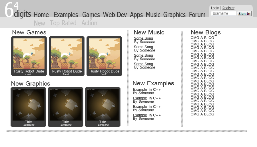
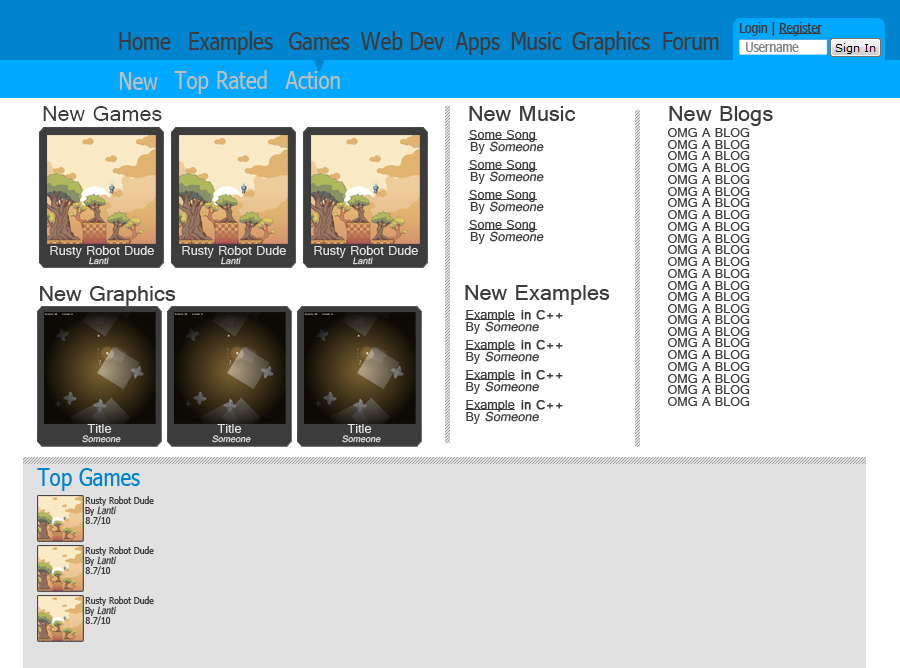
So I didn't have time to develop any other pages. It seems I've developed bronchitis so I've been pretty lethargic.
Just a note to everyone: THIS HAS NOTHING TO DO WITH 64D. I AM NOT REMAKING 64D. I AM MAKING A NEW COMMUNITY.(Yes there is a 64D logo, its a placeholder, it won't be there next design)Design 3: Design 4:
 Things for next design:ETA Friday/Saturday-User page design-Game page design(will be similar to graphics)For those willing to contribute skills:If any of you want to help create the site, please tell me. This is a large project and it will take a long time to create it on my own. I already know a few are willing to help me. I will need people who are good with PHP, MySQL databases, and javascript(preferably jQuery).I have my own server and will create access to it for those who are helping when we get to that point.FOR ALL OTHER QUESTIONS AND PREVIOUS COMMENTS AND IDEAS, VIEW MY PREVIOUS BLOGPrevious Blog
I like the multiple columns.
So you're trying to make a newgrounds? :p
Dont get me wrong, I'm all for it. I'm just a little skeptical thats all.I might try to come up with a layout for the site tomorrow for fun.I'd try going for a grunge theme - I've always liked that. Either that or glass - which fits well with the light blue.
Nobody likes newgrounds, everyone knows that.
I like newgrounds (for the lulz) though it is hard to find the good music since the ratings change every fucking week D:<
PHP sucks. Dynamic webpages are a pain in the ass to code.
Says me. I'm too lazy to legitimately learn PHP and MySQL.I don't have time to explain why at the moment (or at least in detail), but I am strongly against changing the name of 64Digits. I understand your goal is to create a new community, but without the label "64D," many users will get confused and leave.
64Digits has had a somewhat of a bad reputation, and sure, it's community is dying, but that's no reason to completely kill it. Sure, it needs an overhaul, but changing the name, the idea, and basically everything is not the way to go. Expanding, yes, but not ending it.In your previous blog you said that the current design did not allow the site to expand. It might be somewhat true but it can always be modified. If you want (and heck, I'm already doing it anyway), I'll make a new layout that allows more content, based on both v2's and v3's 64D layouts.