So I'm getting over bronchitis pretty easily. Yay antibiotics! I also got paid today for working on websites. YAY $150 FOR DOING NOTHING DIFFERENT!
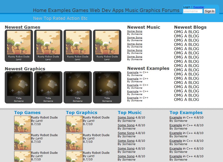
Anyway, onto the real subject matter. If you notice that it looks somewhat different from the last design. The reason is because I was bored and coded the entire site last night. That's right, that is all HTML and working 100% in every browser. I didn't do anything else besides the HTML so that's why the navbar arrow isn't shown, that needs JS.Problems:-Needs a name-Needs a logo-Main nav needs to be smaller, any suggestions for better categorizing?Please post any suggestions to anything in here. After that I will start coding the other parts.
I'm not keen on the colour of the main bar.
The blue looks a bit too… sickly, for want of a better word for describing it.That blue is giving me trouble >_>
I changed it to something else, not much of an improvement though so I'm not gonna upload.I think you should merge Music and graphics into 'Art'. Imo examples doesn't deserve a whole category, it could be a subcategory of each main group. Web Dev, hmm, I'm not so sure of what would someone submit there?
This way you could reduce the main categories into 'Art', 'Games', 'Apps' and 'Web Dev'. However, I still can't make up my mind of whether to merge Games and Apps together, after all, games are technically applications.Thne it would be easy to subcategorize each, anyways, imo the nav bar doesn't need to be too specific. For example, instead of showing 'Action', show 'Genres', and so on. If you try to be too specific with the nav bar, it will always look overloaded thanks to the large scope of the website.I don't like that blue either. Make the darker blue a little darker and change the font color there to something lighter. Make the light blue background a little lighter and make the text darker. If you can't make it right, just take a look at other websites that use blue as their main theme (Facebook, Many IPB boards, etc)I feel a like awkward telling all this to someone who actually works making websites :PFinally, let me say I like your idea for a new community :)I have a suggestion. How about this structure:
– Developers:- Games- Apps- Tutorials/Examples– Artists:- Art- Tutorials– Musicians:- Music- Sound- TutorialsI was thinking that examples would just be examples of each category. Although it could go the other way and get rid of the Examples main nav and put it under the sub nav of each topic.
What would people put into web dev? Maybe templates they've made, javascript stuff, etc.Is it a photoshop mock up or do you have the html and css files?
I have the HTML and CSS all done.
Can you upload it or something so I can play around with it and maybe try and find a better colour. :)