So I'm getting over bronchitis pretty easily. Yay antibiotics! I also got paid today for working on websites. YAY $150 FOR DOING NOTHING DIFFERENT!
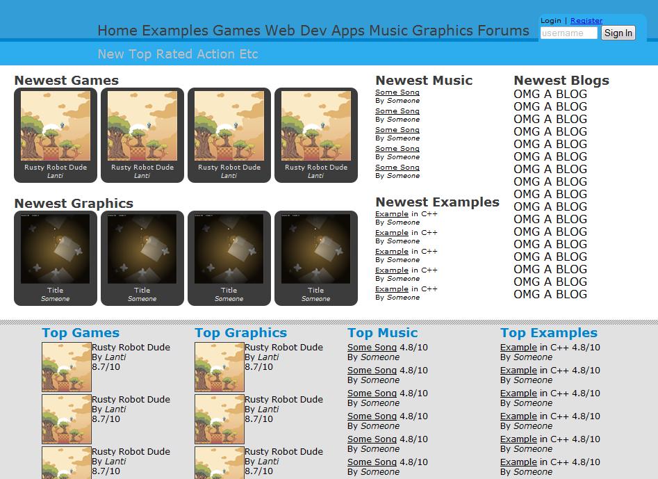
Anyway, onto the real subject matter. If you notice that it looks somewhat different from the last design. The reason is because I was bored and coded the entire site last night. That's right, that is all HTML and working 100% in every browser. I didn't do anything else besides the HTML so that's why the navbar arrow isn't shown, that needs JS.Problems:-Needs a name-Needs a logo-Main nav needs to be smaller, any suggestions for better categorizing?Please post any suggestions to anything in here. After that I will start coding the other parts.
It's not the colour, it's the layout that looks 'not right'.
I made a mockup today. http://64digits.com/users/sir%20Xemic/website.pngIt's a bit small, but that can be fixed.Yeah i think blue is good , just a different shade. Also i think examples should be in games and amps and web dev and maybe even music/art.
and i think the arts could be merged to 'music/art'. that would prolly reduce clutter on the main nav.You can do a navbar arrow without JS. Web Dev and Apps could be combined into Code or Apps.
Maybe this: Home, Games, Apps, Graphics, Music, Forumswith the sub-nav sometimes containing Examples.New and Top-Rated could possibly be sorting options rather than nav options to keep things consistent (genres + examples would go in the games sub-nav for example).Each section should have a front page somewhat like the mockup you have there, with the newest and top-rated stuff showcased. The main site frontpage could have blogs, top-rated stuff from several categories, news, alerts (PM's and followed threads, etc.).The link problem has been fixed.
Yeh, but the developer doesn't need to be appealed to… you don't write the blurb for someone who's already read the book. Damn, I can't think of any more analogies to explain what I mean.
Look at yoyogames or newgrounds. Both have massive developing communities, who use the websites in lots of ways to learn, help, receive feedback and get an audience. But the front page is there to look nice to the majority of visitors who don't care about the development process, exactly why they don't present WIPs or examples on the front page. Yes, it should be linked on the front page for ease of use, I just find it's given too much priority in a potentially multi-talented community. 64d appeals only to game makers, and even it has more emphasis on finished games over examples. And let's face it, it's not particularly popular anymore, so relying on that formula probably isn't the way to go.Sorry for going on about it so much. I guess it's whatever everyone else thinks.Maybe I'm not getting my point across.
I had an idea for a site for developers, for developers to find new techniques and learn new things. Kind of like w3schools, MSDN, tut networks. I didn't want to create a site like newgrounds where the majority of the site's users aren't developers, but people who just go there to play games. I want developers to see what other developers are doing and thinking and learn from each other.Yeh, I figured you did. I'd just prefer a site that could do both without compromising either.
It would be nice, I agree. Maybe when the site actually gets going, it could be kind of split. Are you a developer? Go here, it has lots of examples to teach you. Not a developer? Go here, here's a bunch of things that the developers have made that may be fun/useful.
The idea behind this type of site is this: there isn't a place(as far as I know) where developers can make examples or games and have fun with the community; this site used be like that. Newgrounds is oriented towards gamers(to me it seems), while tutorial sites(like the ones I mentioned above) are oriented towards learning, but not having fun. My goal is to combine them.I like this idea though because I am a developer and a lot of times I have questions about things I don't know. This new community will be more centered on developers so that people can help other people out. And while MOST sites are just plain forums or sites with posted questions, this site would allow you to submit content and look at content from other people. (and also free)
And in turn, you can get help/examples from others and maybe advertise you stuff as well.Here, it is still centered on game maker(even with the added extentions), and blogs. I like 64 digits, but it would be nice to have a site with more general focus on development. ;)