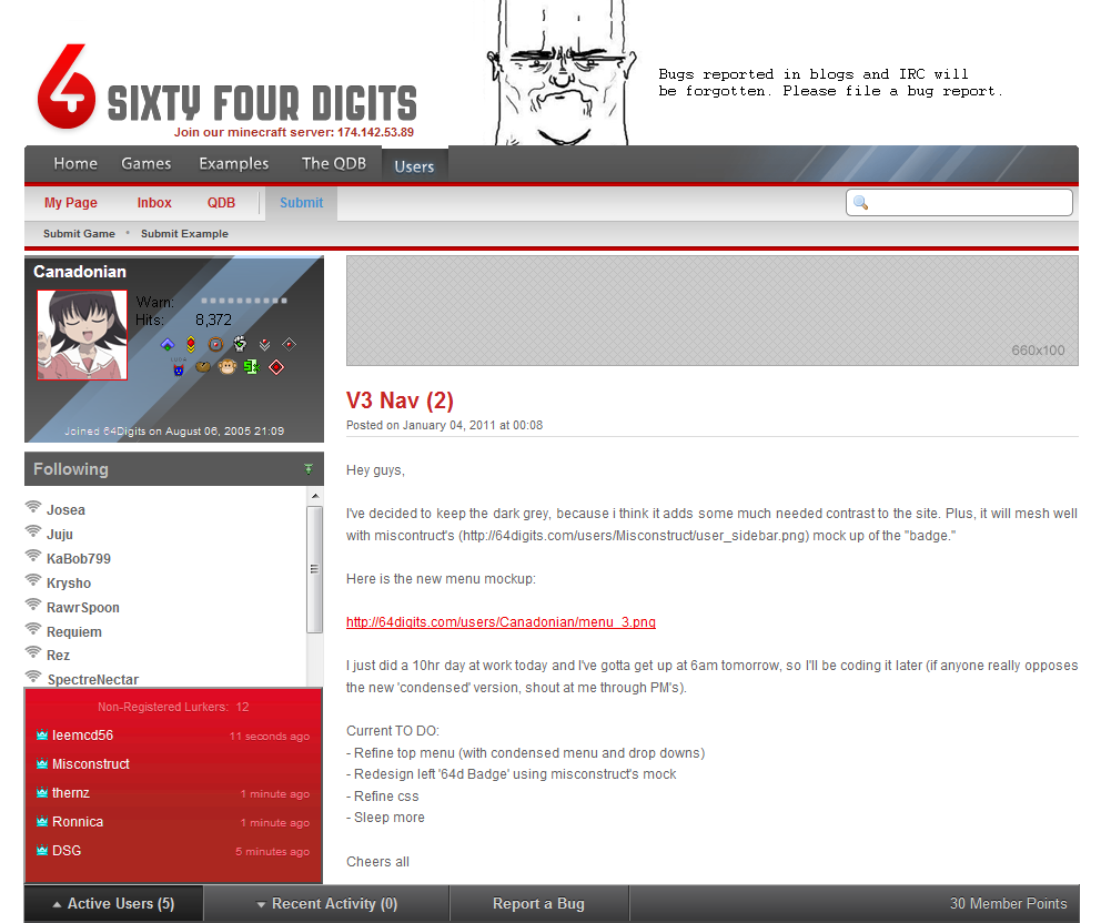
This is a complete mockup of V3, combining ideas of Canadonian and my own.
 It's a quick mockup whipped up in Photoshop, so don't get bent out of shape over flaws such as the fact that "Canadonian" and "Following" in the sidebar are different shades and that the crowns next to the active users have a funky hue. Those are just artifacts from my own speed/laziness in creating the mockup and obviously don't reflect the intended final look of the site.The red hue for the Active Users is wrong, it looks kinda pink/purpleish. The intention is to have it just be a red/dark red gradient, as to match with the other red that appears in 64digits. I was just being lazy and did a quick hue adjustment to get it to a red, period. Which, as I previously brought up, also resulted in borked crowns. Also the text would all be pure white in the Active Users box, not pinkish as depicted in the mockup.
All of the mock ups I've seen are better than the current.
Yours is too shiny though :PYes, there's some shine. But I personally don't think it's overdone. I could've gone way overboard and made the user avatar shiny, the 64d logo shiny, the light part of the menu shiny, etc.
As it is, the main menu bar is shiny for making a nice first impression. And the user badge is shiny, which adds extra visual appeal to a user's page.What bugs me about the 'rays' on the top bar are their arbitrary placement and color; they make the right side of the bar look glossy, but text and the subtle vertical gradient on the left make it look matte. Maybe a dark red tone would be more fitting?
My thoughts:
1) Everything - slightly smaller2) Left side bar - much thinner3) Right side bar - recent activity and active usersWhat I like LEAST is that active users is now a pop-up. A pop-up. As part of a website's design.I don't mind the pop-up, but it's annoying that it stays open after navigating to another page.
The idea is that the recent activity bar stays open in the space the sidebar takes up, so it doesn't get in the way of what you're actually reading.