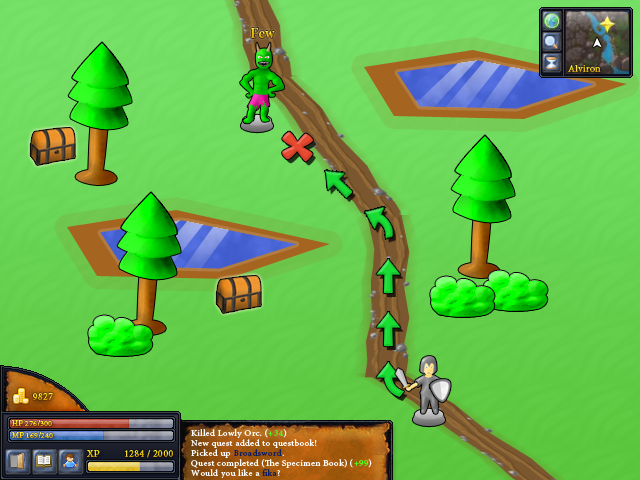
The style of the HUD clashes with the in-game style. I have no skills when it comes to doing character and objects in semi-realistic style, so I went for a more cartoony style.
 Again, just meant to show off a concept.I was thinking of an RPG where you walk around a map (like above) and when you, say, meet a few orcs you'll enter platformer-mode where you fight said orcs.I doubt I'll ever make it, though.
Reminds me of some of the YYG competitions winners. I guess this kind of shameless cartoon graphics is what kids like nowadays.
I… like it.
Ancient Ants Adventure. Anyone?…
Interesting idea. I like the overall look and feel. It seems like a game I'd play. Running into an enemy and fighting them in a platformer setting is a fun experience - Zelda 2 pulled it off and was a blast. I hope you do get on this game, I'd definitely play :D
TROLLS LIVE UNDER A BRIDGE AND NEVER STAND BY THE ROAD.
wait is that an orc??he wasn't fed properly… give him some pork meat.Looks very good, but I think some icons on the buttons are a bit blurry and lack contrast.
What Infinity_Plus said.So like Zelda 2?ORCS DONT WEAR PINK SKIRTS!! RRRRAAAAAAAAGGGGGGGEEEEEEEE
Mush: Yep, thinking the same thing. That part of the HUD is done in a more pixelart-style, which makes the buttons look blurry. I'll need to fix that.