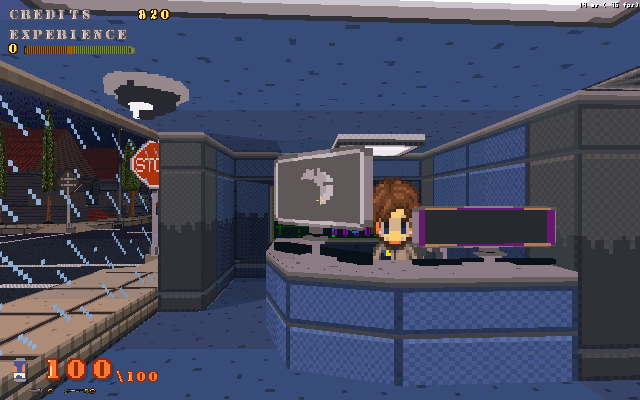
I've found some time over my vacation to get some work done. For one thing in the editor I've removed the height map tool(I decided to not use it) and added an Event option(something I realized I never had) as well as altered the display to have several other toggles on the top screen besides just objects and lights.
Also added several new tile types, stairs and slopes, grass tiles(which will grow in height depending on how many adjacent grass tiles are present and depending on a setting you'll be able to alter in the map's options*planned*), also groups of tree trunk and tree top tiles(very bottom screenshot) so one doesn't need to build a forest of objects.Of course now I need to rework my collision system to accomedate the newer tiles.Also I finally did something about the fog, which now will only appear in the distance instead of all the way up to the camera, as depicted in the screenshot below. Also I've changed the light system so that lights can have either or both a source emitting graphic(fire or flames) and a glow graphic(glow falloff) or none at all. Also these emitting sources can be constant or night only. Stressing the stress test map even more with even more stuff. Unfortunatly my idea of using transparent height-mapped clouds is having an ill effect on using translucent effects like fire and glows so I may need to rethink things.
 A room containing ramps and stairs.
 Using tree tiles to create a forest, the cieling composed of tree tops. There will be other tree groups to pick from in the future, and when harvesting wood from a tree tile the trees remain where as a tree object will be replaced by a tree stump.Street lamps more like COW now. Less boxy.
Screenshots look awesome man.
This ISN'T being made in GM, right?
it is, he's just using U3D dll ( i think)
GM with U3d, originally I had started it with just GM, as previous blogs of mine will depict, and although it did go pretty far, it just didn't go far enough. I've still got some work to do, as you can tell that last screenshot has a pretty weak fps.
Oh, ok, nice.
Very impressive, It didn't even look like GM.The first one looks good except for the lampposts. The other two are awkward.
I'm not to happy with the lamp post either, I think I had made better ones in the COW RPG.
I agree with Ludamad here. The first one is great, minus those lamp lights.