Well it needs a little more work I think. I've made his head two pixels shorter and his legs 3 pixels longer from the last post. Here's a vid showing a simple 8 frame animation of template man.
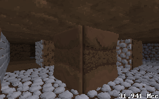
Suggestions?VidFinally, walls that can have four different faces.

TEMPLATE MAN
he smashes polygons!he breaks through walls!he flies at a static speed of your own choosing!no but really looks awesome, way better than i expectedThat is amazing, but what is up with his left eye?
Eyeball glare, probably remove it.
Cool stuff, would look far better actually animated. I don't like the yellow light in the background that much for some reason :P
http://www.youtube.com/watch?v=S_5Wa-r9wnM
Special feature?Finally! A game where you can actually see your own body! That always really frustrates me.
What FPS is this all running at?I don't think those are the main characters juju…
I'm not sure really, it goes by clock speed. So far its been pretty good.
Still playing with character design, Im thinking of having heads be individual objects from the body.In the first video you had on your blog, perhaps its just me, but his head looks a bit too spherical. Then again, I'm no artist myself.
However, if I am right, you could shorten the width on his head a bit.@ferret I think he means in that recent video he posted where he looks down and you can see your body and neck