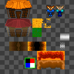
NES, its old, its 8-bit and it had limited colors.
Lately I've become interested in Playpower, a group thats bringing back the old NES into a computer for for developing nations. Basicly its the Famicon built into a keyboard, with controllers and mouse.www.playpower.organdwww.playpowerorg.ning.comSo I like challanges and limits, and I have an old low-res RPG game that might convert well.Of course after reading up on NES some more, I found out these things:1) 16 color limit for background and sprites(32 total)2) 3 colors per 8x8 tile/sprite max. The fourth color being transparent3) 64 color system palette, most blacks can't be used so its more like 60.4) Sprites/tiles composed of a color code layer and a color assigned layer.5) 8 sprite limit per row…Wow, and thats only a few of them.Anyways, I pitched my old RPG, 7th Ring of the 7th star to them and found at least one person interested in helping me flesh out the story.Since the platform seems to be going towards educational fun, I decided to have the combat system and some puzzles be math based.Right now I'm just toying with the idea, as I do have the ever in progress 'The Crawl' and two other projects that should be wrapped up before the year ends. I'd like to finish of Shield Breaker and E vs O Lock Puzzle, TC will take awhile.Anyway, heres the results of me downgrading SNES style to NES style. Also decided on using my concept RPG's world map for The Crawl RPGI don't know if I'll ever work with polygons again…or at least not in conventional 3d methods.Some models I've made for The Crawl RPG are created from a few 3d models, then colored, chiseled and shapped in Slab6. I'm really starting to enjoy Slab, but I think I'll be making some modifications to it(source is included) to be Netbook friendly, as in not needing to use the num-pad for certain actions, and possibly other little tweaks that may improve editing.On developement for The Crawl, I'm trying to clean up the code some more and I'm inserting the RPG code into the main source so I can start working with items. Key's first since I need to make sure I can get doors to be solid when locked.
Strongly preferring the NES style here.
Same here, looks better with less colors.
I don't =p
2/3 isn't bad. Kabob must be one of those eye-candy kids ;)
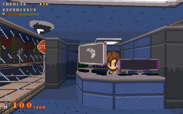
Heres some retro mockup.I like both, but the NES style seems to have a bit more distinction to it, imo.
Love the NES limitations.
Don't be afraid to mix up the hues of your tiles - for example you can put some blue in the rocks and maybe a little yellow in the grass.I can tell already there will be recolors galore.
I think the building loses something, but the actual terrain actually looks more skillful and interesting with the dithering and palette crunch put on it…
I have to make use of checker patterns, but its kind of fun.
Here's one of the Sandmen converted, I'm not sure if I'll add more detail or not.