Hey guys just a quick look into the progress that's been done into my compo entry so far. I'm making a game called Hero's Fantasy: Song of Dueplin.
This is a look at the beginning cuscene for the game that I've recently finished-The game starts at one some people may call the end of a unexplained previous unexplained adventure, similair to how Indiana Jones movies usually start. One of the character's, Clara, is being dragged into Dureel prison.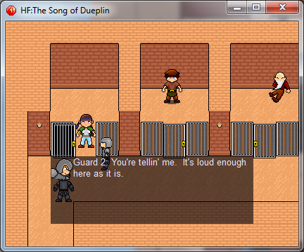 In the cell next to her is the hero of the game, Dueplin. Dueplin was once a farmer in the hill country of Germashire to the north.
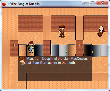 Dueplin has been in prison for 8 long years, and the reason is not explained until later in the game. Yet, Clara offers to free him if he helps her escape. Somehow, and to Dueplin's surprise, Clara is able to pick both their locks.
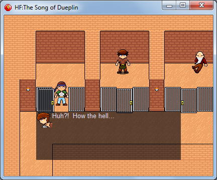 You then assume control of Dueplin and have go to gather some equipment.
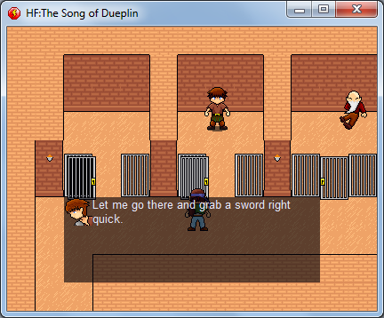
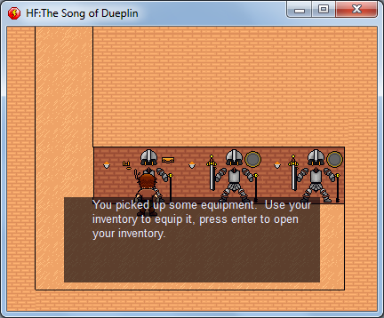 I still gotta do some work on the inventory system before going to much futher, but that about sums up how the game starts. You really don't know the characters backgrounds but part of the game's story involves learning about them over time. I have the basics of the battle system done.
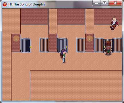
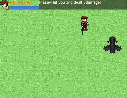 It plays similair to Secret of Mana you might say. Whenever you attack, the green meter below your health goes to 0. But it slowly refills. When it is back up to full, you'll be able to attack again. As you gain levels, it'll refill faster. Overall, it actually plays pretty nice.So for just one days work, I think it's shaping up nicely. Thanks for reading!EDIT: I did some work on reshading the prison, I thought it fit the theme better if it was darker. What do you guys think?New-
 Old
Old

These sprites are pretty nice.
Thanks! I can't take credit for the grass tile on the bottum though, it's only a place holder. The rest are mine though.
I did some work on reshading the prison, I thought it fit the theme better if it was darker. What do you guys think?
New-I'd make the 'ceiling' tiles darker. More contrast with the walkable portion would help visually imo. Decent graphics, though.
I think the dialog needs polish.
As in the font or what the text says?
I think he means the overall look of the box itself. Give it some borders around the edge and the portrait maybe? Neat sprites though! Good luck. :)
^Yesh.
Given the progress some of you guys are making you would think this was a 72-hour compo.
I mean seriously this looks pretty good for this early in the competition.You need epic battle logs that save to text files, so after I grind for hours upon end to get to the max level I can post the 2gig file here of "Some shit hit you for 0" over and over again.