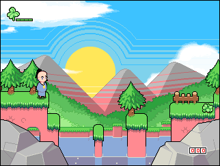
K, first I'll address some of the comments made on my last entry, about the red combo text. 
Like I said yesterday, it does look better in motion, the numbers sorta 'explode' and they are only red while you're performing a combo, as soon as you land, or stop attacking, they fade to white.
I would've preferred to have them white, but you would hardly even see the text if a cloud was in the background..
However, I know I do want to change it in some way, at the moment, in the screenshot at least, it just doesn't look like it fits in… hmmm…
Yesterday I said I would make everything Cocopuffs would need for the new story, well, I at least started, and I wasn't really being lazy, it was just a bit more work than I was anticipating.
I'm just about finished with the foreground parallax layer, I plan on putting some grass blades, maybe some flowers etc.
Also, I've been working on some cool effects for the first cut scene, I don't have anything I could show as an image at the moment, but it will look very cool in the game.

And lastly, yesterday I linked to a youtube video of Brothers in Arms on DS, well, the game was dumped last night, I've downloaded it and I've been playing a ton of it, pretty impressive stuff for a DS game, driving missions are especially fun.


BYAAH!


 And lastly, yesterday I linked to a youtube video of Brothers in Arms on DS, well, the game was dumped last night, I've downloaded it and I've been playing a ton of it, pretty impressive stuff for a DS game, driving missions are especially fun.
 BYAAH!
This just keeps getting better and better. Keep it up. =)
Oooh! Beautiful! Maybe borders for that red text? Same way as that life bar has.
The Foreground Parallax is taking it too far!
Kesä = Summer in finnish, so yes it does. ;D
Ok, the drawing style look great [:)], but it is probily an rpg. Which in that case i no like. (and fix the retarded character.
Hey - the score counter is only 3-digit in that screenshot. =O
I don't know how anyone could work out it's an RPG from one screenshot..
and yah, it only has 3 digits because it's just a mockup made in photoshop, the rocks in-game will be less noticeable ;)Yay for chibi.