K, first I'll address some of the comments made on my last entry, about the red combo text. 
Like I said yesterday, it does look better in motion, the numbers sorta 'explode' and they are only red while you're performing a combo, as soon as you land, or stop attacking, they fade to white.
I would've preferred to have them white, but you would hardly even see the text if a cloud was in the background..
However, I know I do want to change it in some way, at the moment, in the screenshot at least, it just doesn't look like it fits in… hmmm…
Yesterday I said I would make everything Cocopuffs would need for the new story, well, I at least started, and I wasn't really being lazy, it was just a bit more work than I was anticipating.
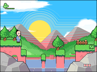
I'm just about finished with the foreground parallax layer, I plan on putting some grass blades, maybe some flowers etc.
Also, I've been working on some cool effects for the first cut scene, I don't have anything I could show as an image at the moment, but it will look very cool in the game.

And lastly, yesterday I linked to a youtube video of Brothers in Arms on DS, well, the game was dumped last night, I've downloaded it and I've been playing a ton of it, pretty impressive stuff for a DS game, driving missions are especially fun.


BYAAH!


 And lastly, yesterday I linked to a youtube video of Brothers in Arms on DS, well, the game was dumped last night, I've downloaded it and I've been playing a ton of it, pretty impressive stuff for a DS game, driving missions are especially fun.
 BYAAH!
it looks nice though whats wup with the rocks? the light source is way off. the top of the rocks on the left are dark and the tops of the right ones are light…they shapes are great, just the shading is confusing.
@stampedeplatformers can be RPGs…