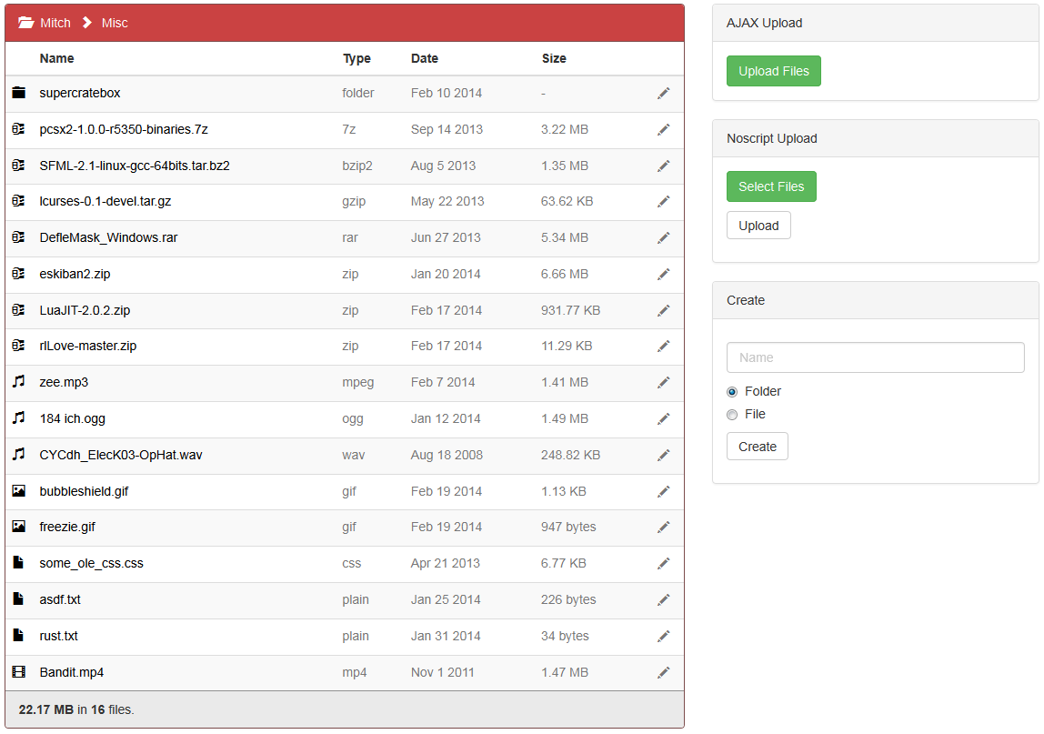
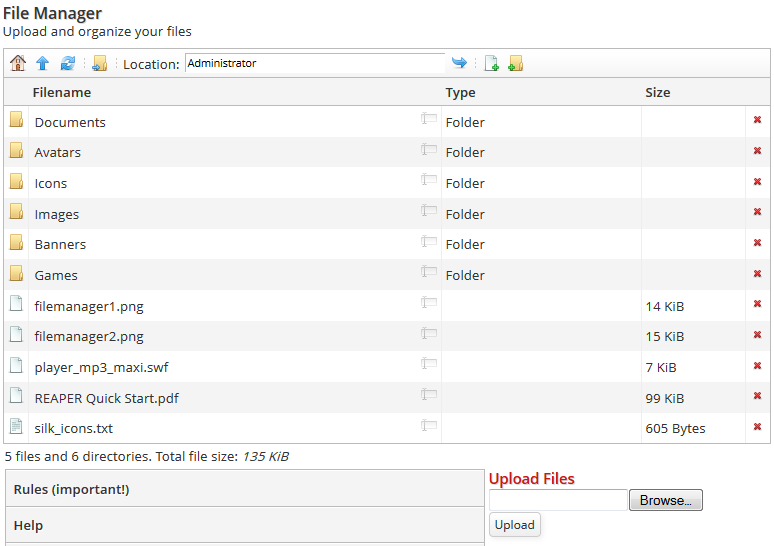
I'm at a crossroads in regards to v4 dev, and I'm gonna need some help deciding how to continue. You're probably (or not) aware that I've been writing the new file manager, but you are probably less aware that this isn't my first attempt at writing us a better file manager. So I actually wrote one long ago that was very capable, but when I showed it to ChIkEn he asked me if I could make it AJAX. I ultimately decided to rewrite it from scratch with AJAX in mind, and the result so far has been promising:
 (click for some animation of it in action)It's still unfinished in some areas (the file tree doesn't always get refreshed automatically), but I was thinking aside from that it's still a little confusing to use. I posted my old design in IRC and it was met with favorable opinion, which got me thinking about redesigning the new one to be more like the old one. So now for comparison I present to you the old one:
 (again, click 4 gif)What do you think? Do you like the idea of a file tree or does it make more sense to keep it focused on one folder at a time? What do about the preview pane for images and such? Suggestions? Questions? Advice? Lemme hear your opinions!Oh, and unrelated note, I made a twitter finally (@aeron64). I tried to follow as many of you guys as I could find just by guessing names but I hardly found everyone. Now add me so I can add you!

Second one is much better.
More info and visibility is a lot more useful than just previews of files.Bring back the downloads counter.
Fuck you, ChIkEn, I used that to stroke my ego.I like the idea of ads for revenue. Could even make Member Points slightly less useless by having them disable ads for the user in question.
Not that Member Points are likely to make the transition to V4. I can't see a practical use at all.That file manager is sexy and I know it.
The older one there reminds me of Dolphin, somewhat. I approve of both, and the preview is a nice touch.
Those gifs look awesome
I really like the style of the second picture, I like the preview of the first, and drag and drop is gravy
Sexy seconds!