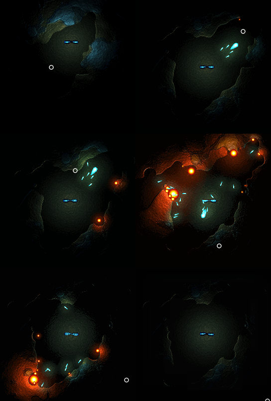
I always felt bad about not finishing my 2D Light and Shadow blog series. I had everything planned for the third and final blog but never actually wrote it. God Dammit! I wish I had at least kept an outline written somewhere. I know I wanted to touch on specular reflection and utilizing normal maps on a 2D scene. It would have had examples that extended those demos in the second blog. And I probably would have shown off the game I was working on that made me start the series in the first place.
Well, I never got around to writing that third blog. And the game got tucked away and forgotten as I got busy with my new job, school, and other endeavors. But recently I found the forgotten game and it reminded me how bad I wanted to show it off in the third blog. Made me want to provide some closure.
Well, this was all over two years ago. At this point I would have trouble recognizing a specular reflection calculation if it bit me in the face! I'm sorry if you were anxiously waiting for that last installment that never came. Sadly that train of thought of mine has long been derailed, and likely isn't going to check into the station any time soon.
But know that there was not that big a jump from where the blogs left off. If you understood the vector math involved in diffuse lighting, you could certainly figure out specular after 5 minutes of googling. And if you work through the ins and outs of both you should be able to figure out how to calculate against a normal map instead of treating every pixel as flat. But maybe its good that I leave this as an exercise to the reader. By working through it yourself you can really learn to manipulate it in interesting ways and achieve the best results. Yes, I'm going with that excuse. Silver linings ;)
I hope this blurb (and perhaps the other blogs) will inspire some of you to start your own lighting journey. If the gifs above weren't enough inspiration for you, I have attached a video that shows more of the forgotten project. Since I was feeling nostalgic I added music that I recorded around that time period.
Maybe someday I will revive said project. I have a tendency to recycle my projects anyways (finished or unfinished). In the meantime, if you guys have any questions about lighting fire away! Might as well answer them here while I'm thinking about it.


That looks sooooo good. I really wish my lighting was even half as good as that. The lighting in my game was pretty much the best I can do at this point…
I love 2D lighting done well like this. Though I'm finding myself more curious for some reason as to how you implemented your destructible terrain.
Mega, the answer is multiple surfaces and a separate collision matrix. First some background: The rendering pipeline in general needs everything to be rendered twice, once in color and again as a heightmap. After the whole game is rendered to two surfaces, they are passed into the lighting shader, which computes normals from the heightmap and lighting. (There is actually a third emissive channel that the bullets / explosions are rendered to, it remains unlit).
So the level class ended up with 4 inner surfaces: foreground, background, foreground height, background height. The background just handles the dirt wall in the background and isn't ever changed. The foreground contains the terrain itself and must match the collision matrix. So when a bullet collides with terrain, a circle is generated and all points in that circle get processed for both foreground and foreground height. The surface pixels are set to transparent, and a crater texture is subtly multiplied against the heightmap. The collision matrix is updated to match. (Oh, also the destruction ignores rock material.)There are some issues with my approach. For instance, because I render to a heightmap and compute normals from that, everything has an awkward bubble around it. I say awkward because it looks great on the static terrain, but gives a strange effect on the edge of the player as it moves over a varying height channel in the background. The end result is different than if I had rendered separately precomputed normal channels instead of a uniform heightmap channel.Also the crater texture idea was good in theory but in practice it can flatten the heightmap entirely after many shots to the same area. If you shoot at a rock for long enough it just flattens out and looks awful.