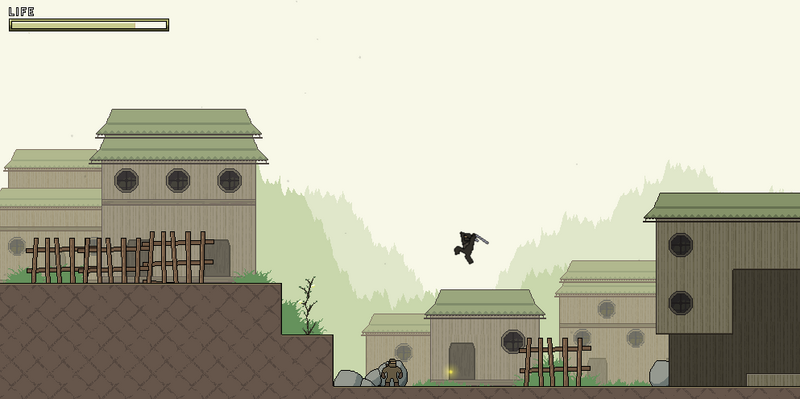
So what's new on Katakijin? Well..quite a lot actually.
I revamped the damage system. It was too complicated before. It used to be calculated based on how close you were to the enemy; the closer, the more damage you do. Also, whether an enemy was just standing or attacking affected it as well. That's why it seems like sometimes it took forever for them to die and sometimes they died pretty fast. Now, It's back to the traditional damage system. Basically no matter when they get hit, its the same damage. Now, some combos do more damage than others, but yeah. It's much more easier this time to kill enemies and the game flows better.Also, i added….Ultimate Techniques! They work exactly like they do in Ninja Gaiden. When you press a button, the Ninja will start to charge, if you release, he will just slash. If you charge long enough, he will reach level 1. If you release, he will do a 6 hit autocombo. However, of you hold it to level 2, he does a 10 hit autocombo. Enemies release essence and charging absorbs the essence, which increases the charge. It's kind of overkill right now because the base Ninjas die so fast when hit with it, but it looks cool.Now, I'm tackling Ninpo attacks. I'm still debating what the Ninpo charging animation should be: a hand sign animation like in Naruto or the arm motions like in Ninja Gaiden. I have 3 ninpo attacks in the works:1. A Thousand Wind Blades - like the Ninja Gaiden 2 demo. Wind slices enemies up.2. Enrage the Fire Dragon - it's fire and it burns things up.3. Lightning Storm - guess?I've now started the Village Area, and I will leave you with a screenshot:

Do the buildings in the farther back scroll at a different speed than the ones in the front?Because that would add that last touch to a very well colored theme(though the ground tile looks weird)
Damage systems should be kept simple,sad how many forget KISSNever played ninja gaiden, but this is looking totally awesome.
Just keep adding plants and boulders.
I hate my graphics card for not being able to play GM games. Can you steal one for me?
I love this project, but PLEASE, get rid of the knyttish tiles. This game could be way original, without everyone talking about "that knytt ninja game".
Yes. please replace the ground tiles.
Demo or progress didn't happen :o
Woah. Awesome.
I don't really care much whether it has the heavily-inspired Knytt look or not, The main thing is how it plays and so far it plays pretty sweet.
I think this game can have the Knytt tiles without looking too knytt. I mean look at the village level…yeah, it's a little bit knytt, but not so much