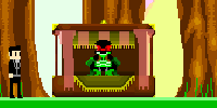
So I've been getting down to work on my game, and i was wondering if there's any suggestions you might have for it, besides the fact the game's graphics are shit.
Here's some pics of the new menus:

 Here's some stuff that some people requested a while ago:Now, you can tell where you were shot from by the blood that smears onto your screen, while most shooters in the gaming industry have this, i've oddly never seen this feature in a game maker tds before, so I'm interested in hearing some feedback about it:
 Next small feature I've added is a Halo-style overshield, requested by Alert.(Looks 100x better in-game tho.)


Both features should make the game feel much easier to play, and much more like a pick up and play game.I've also made the Rapid Fire Rifle(the assault rifle you start off with), shoot a little faster, and gave it a small damage boost, which makes the gun feel much better and much more fun to use.Another thing is, that I've made the AI much smarter, one of the new things they do, is that they try to stay near you whenever you're the last two left, so that should also make the game much easier to play. =DAlso, gonna try to include an auto-updater for the next beta, so you can get the latest build of the game instantly.So any suggestions, or anything that doesn't involve mentioning my shitty graphics? =D
 Here's some stuff that some people requested a while ago:Now, you can tell where you were shot from by the blood that smears onto your screen, while most shooters in the gaming industry have this, i've oddly never seen this feature in a game maker tds before, so I'm interested in hearing some feedback about it:
 Next small feature I've added is a Halo-style overshield, requested by Alert.(Looks 100x better in-game tho.)


Looks pretty cool. I think the best way to get feedback is to have the alpha ready to play.
Also, it would be cool to be able to play multiplayer matches. Then people would be more willing to try it out :o Im still working on the api though. but im getting closer to being done.The next public alpha is coming soon, that's why i'm asking for some quick feedback and see what people would like to see before it actually comes out. I don't think the game is ready for mp just yet, I'd rather get the gameplay where it needs to be before I get into that.
Cool. Cool. I think the menu text has too visible of shadow, and the weapon box looks like a 12 year old made it.
But those things aside, i do like the improvements and the graphics can be improved later.Alright good thinking. i hope to see it ready for it soon though :Di wonder if maybe the shadow on those objects should be more visible? XD
plus if there is a shadow then the light source would have to change on the sprites :F i wonder if it could be done well with drawing actions…wow, do you want invisible shadows on everything?
the shadows don't stick out as much as you're making them out to be.also, what's wrong with the weapons box?