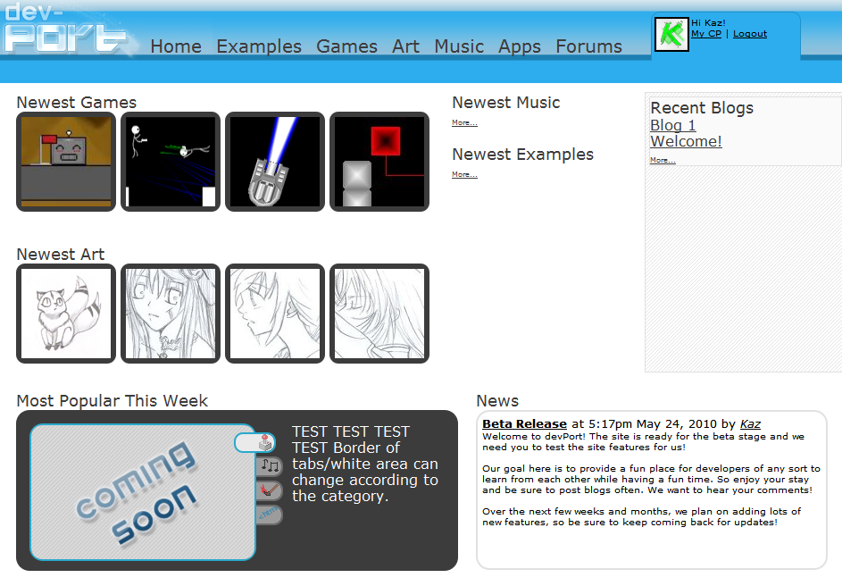
Remember before Christmas I wanted to make a new community that isn't dead and actually had some real developers? Well, here's that blog:
Link to BlogFlash forward to now, and devPort is ready for release. At least a beta release. devPortdevPort is my goal to make a community of developers who are actually interested in learning new things from other people and examples all while having fun in an interactive environment.Many of the basic features of the site are completed and we already have plans for new ones which we will be working on very soon. I'm sure there are some bugs though, so let us know of any by making a blog or posting here.

Nice layout, but I'd get some artsy fellows to give it a go before doing the fine tuning and coding.
Cool website. Should change the font in the nav bar.
Thanks for the suggestions, any suggestions are great to do as much improvement as possible!
Any specific ideas are great too. Right now we are working out a few glitches on some things, but feel free to try it out.Was this a collaboration? How many users and who?
It was a project between Alert and I
Very cool
Oh
MyGodThat design is horrible. Strange use of font sizes and strange use of padding are the main causes.The layout is okay, though.Let's just get it straight: rounded edges OR sharp edges. Not both.
@Xemic: Figured you would've said something like that.
The point of the site is functionality, not to be the most amazing looking thing ever. Try the site first, then offer suggestions, not criticisms.Seriously, it would look a lot better if the font were correctly sized and if everything could breathe a bit more.