Remember before Christmas I wanted to make a new community that isn't dead and actually had some real developers? Well, here's that blog:
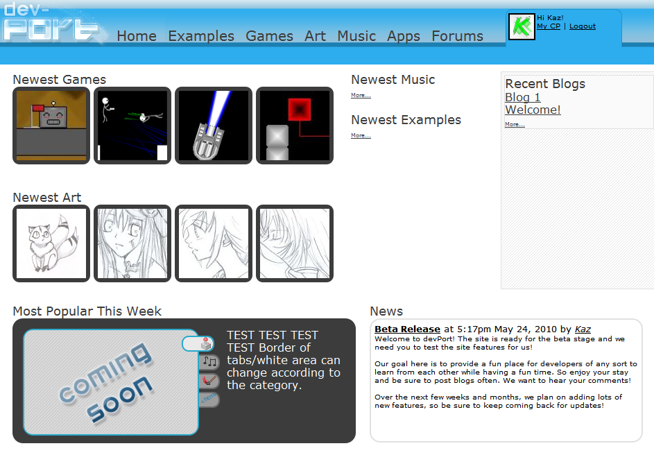
Link to BlogFlash forward to now, and devPort is ready for release. At least a beta release. devPortdevPort is my goal to make a community of developers who are actually interested in learning new things from other people and examples all while having fun in an interactive environment.Many of the basic features of the site are completed and we already have plans for new ones which we will be working on very soon. I'm sure there are some bugs though, so let us know of any by making a blog or posting here.

Ah there we go, we will see what we can do. Thanks.
arg I need a scanner…. maybe that new printer has one but idk how to use it. NO!!!!
Well learn and post stuff!
I don't care for the design much, but it's nice to see someone's actually making a more multi-platform community.
Specifically I'm not a fan of huge font and curvy, "vectory" layouts. I'm not blind, y'know? I also think you could define the sections of the front page a bit better, sort of "windowed". If you look on 64d, YoYoGames or PixelJoint, they all have it.Indeed, we did talk about sectioning things off a bit, but never really played with it. Thanks for reminding us =)
@toast: yeah, its still in beta stage so we will be working on that part, but the main point is its functionality so far. The blogs section right now is the only "windowed" kind of section. Not everything needs a border though! Youre not blind ;)
But yeah so far the site has pretty good basic features like:posting blogsposting submissionsadding friendscomments and ratinglist view of submissions (with categories!)It looks kind of clunky. One thing that might make it better is get rid of that ugly shine or make it smoother. Also, where the user options stretch along the header, move the line down so it doesn't take up half of the header >_>
Other than that, it's okay, but just a bit unorganized. Nice job :oFound a bug, I think. It won't let me register with my email address. My email ends in "@yahoo.co.uk", which is apparently an invalid email address.
Hmmm damn. Unfortunately I work all day and won't be able to get to it tonight, in which case you'll be sleeping most likely. I'll post here when I get that fixed marbs, thanks for the heads up though!