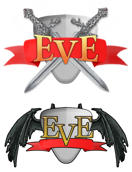
Following up on the inventory and dialogue mock-ups, I made this as a concept for a logo.
 The swords and the wings are taken from google images.I should totally make an RPG.
Following up on the inventory and dialogue mock-ups, I made this as a concept for a logo.
 The swords and the wings are taken from google images.I should totally make an RPG.
Make an RPG nao!
The second one is much better. The smaller ribbon and the stroke around each item makes it look cleaner. Plus, there's a bit less saturation. I would get rid of the horn-esque stubs near the top, though.
I completely recognize the swords. Is that bad?
What are they from?
The swords match the shield better than the wings do. The top one is nice and smooth, but the ribbon looks a little large and blurry. Finally, compared to the detail that the swords, wings, and even the ribbon have, the shield is very dull and boring.
Other than that, not bad.The top one is better.
Obelisk: Nah, that's not too bad.
Kilin: The point of a concept is just to give a general idea. If I was to make a final logo for the game I would make it higher resolution, and remake everything in the concept.If you manage to merge the two successfully, it'll look awesome. (small ribbon though)
I like the definition in the winged icon, the outlining really makes it jump out to me. The swords/shield icon seems a bit blurred and gives more of a 'bleh' feeling. Nice work :D