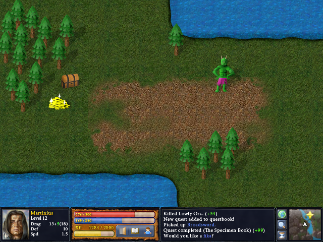
Now I'm doing the beginnings of something that looks like in-game graphics.
 I stole the grass and the dirt from Heroes of Might and Magic 3.In unrelated news, I made another tune. It's a nice composition. Pretty simple, but it works. It's a remix.A Child is Dead.mp3
You should either (A) make your own graphics (B) use the same graphic styled games.
Scott AW: The only things I didn't make myself are the parchment edges and the grass/dirt-texture. It's still hard to maintain a consistent style.
Really though, it looks good overall. The orc and golds are by far the weakest link. Fix them and you've got something pretty nice.
I'd say: Add an extra layer for the trees (4 instead of 3), covering up more of the base. They're not necessarily bad, though.
Its just the super detail of the textures clash with the rest. Wasn't sure what was original or ripped.
Yes, I'd like some fika
Me too <3
Hate to break it to you, but those HoMM3 shots don't look skewed to me. Shown at assorted angles, yes, but not outright crooked. There is no reasonable perspective in the history of anything that works like that, and in working with 2D you're also going to have to account for a relatively fixed perspective regardless of how any object relates to any other, meaning you need something consistent throughout.
As is, the trees imply something very straight-on, the orc looks like he's leaning slightly to the right, and the chest looks like someone put it together wrong.Hard as I'm being on the thing, the texture and lighting on it looks fine, it's just that the perspective is botched horribly.As for the gold, I seem to be the only person here who thinks it's remotely good, if a bit oversaturated compared to everything else. Glowly bling or not, that shit's bright!the troll looks camp.
pink shorts hands on hips…but yeah, exept for the troll and gold its awesomeThe troll looks like an annoyed housewife.