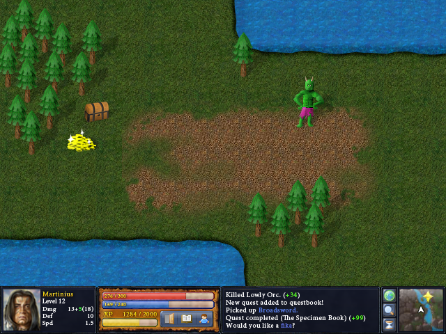
Now I'm doing the beginnings of something that looks like in-game graphics.
 I stole the grass and the dirt from Heroes of Might and Magic 3.In unrelated news, I made another tune. It's a nice composition. Pretty simple, but it works. It's a remix.A Child is Dead.mp3
"You said you'd be back by midnight!"
The tiles look excellent. If anything, that's the part I'd say looks the best. Too bad you didn't do those. >=[
I don't believe that the chest is supposed to be like that, especially in the midst of everything else. It's the only thing that attempts perspective, but does it so wrong. Also, why even do perspective if nothing else does? It sticks out like a sore thumb. An ugly one.The troll looks okay except for the fact that one arm is bulkier than the other, and it doesn't even look like he's turned in a way that it would make sense.I think the gold looks fine, but probably either a little less bright or a little more detail.The trees look good.But really, the chest bothers the hell out of me. I wouldn't like that in any game, even if it were made by professionals.Other than that, it's a cool picture.