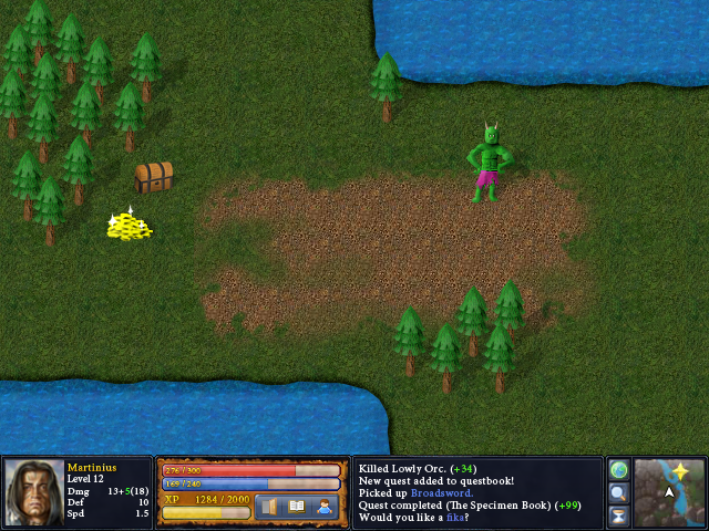
Now I'm doing the beginnings of something that looks like in-game graphics.
 I stole the grass and the dirt from Heroes of Might and Magic 3.In unrelated news, I made another tune. It's a nice composition. Pretty simple, but it works. It's a remix.A Child is Dead.mp3
Everything's the size of the trees! :O It's giant-and-slightly-skewed perspective land!
Seriously, that chest is crooked. : |The troll is crooked. A metaphor for the internet, perhaps?
uh zaron, I think it's supposed to be. And I think it looks good. The orc and the, uh, gold? don't look quite as nice though. The shadows are a nice touch though.
Even if it is for some odd reason supposed to be bizarrely skewed, the top right corner looks incredibly weird and the angle of the right-hand metal bit on the lid doesn't match *anything*.
I refuse to comment on the orc until I can see his right arm well enough to differentiate it from the grass, because as is it blends in rather oddly and makes me think he just has one really ripped fap and and another he flails around.And yes, Vance is right, he's crooked to. I'd be more inclined to think he and the chest are meant to be if the trees matched their perspective at all, but if they did it would just look incredibly weird.FCYW is right. It's supposed to be skewed.
This style is taken from the game Heroes of Might and Magic 3:http://www.google.no/images?hl=no&q=HOMM3&cts=1280639741704&um=1&ie=UTF-8&source=og&sa=N&tab=wi&biw=1440&bih=773Looking nice. HoMM 3 was a great game.
That water… it wasn't there before, was it?
The troll is trolling the perspective.
Walter: Have you taken your pills today? ;]
Juju: Yeah, the troll looks flat.It'd help if you could make some models. Very few people have the skill to draw detailed 3D objects and make them consistent.