Little bit about my remake of an old rpg I did 5 years ago…
Well I haven't done much coding for it, but I been kind of focused on art direction. The style for the monsters and characters seems to be working well, sketch, scan and sketchup. I decided to stick with Google's Sketchup over InkScape as I feel like I have more control over it. One day I'll have to delve into InkScape a little deeper, but for now since I'm justing focusing on creating line art and using simple coloring in a paint program, all those fancy details are not needed.One hurdle I'm having is how the overall world will look. I think I may of created a decent method of creating the tiles. I'm going for a somewhat hi-resolution approach, tiles will be 32x32-64x64 with characters 64x64. I know this isn't very high by comparison to 'modern' games but definatly higher than the original and old 8bit games. I'm going for a 640x480 resolution so far.It has a nice dialog/message system…which I haven't finished yet. But it works, I swear! Although at the rate I've been going with game development, I may just have to send whatever I have to Juju for his engine he's working on. Is that project still going? I don't know, but at least he'll chalk out a nice engine if it falls apart.Anyways, heres a sample of what tiles I've done and the main character sprite. I'm not entirely happy with it, colors, contrasts and whatever needs some work. Suggestions? And heres my current round up of completed(or at least colored) monsters. Which one looks like Perez Hilton?


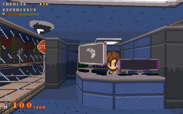
 Oh and a little about my ambitious and yet rather dorment 3d rpg maker 'The Crawl'. Well not much has been done on anything really, but I am amassing a pretty large texture library. Alot of the images are still in their raw state, as in huge, misportioned, needing skewing and made to tile properly. It will give alot to work with. I update with an actual count of textures both done and waiting to be processed.
The pink one.
"Anyways, heres a sample of what tiles I've done and the main character sprite. I'm not entirely happy with it, colors, contrasts and whatever needs some work. Suggestions?"
Texture. You need to break up that monotonous space with texture.Well yes I suppose I can stray from the solid colors to some degree. I'll try and play around with it some 'til I get something I like.
The answer is each looks like Perez Hilton.
Bit like Bob Dylan in I'm not there.
Some texture added to the raised land set of tiles, redid the veggie overgrowth, but will probably redo it again.@sk8m8trix
I don't know why you see that, and I don't want to know why…Yes, that's looking a whole lot better!
Thanks, it still a work in progress. Currently its kind of my only block on creating this is finding the best method to make the background tiles.
I blame the movie Teeth.