Playing around with various display styles for my cubic dungeon crawler. Pic your fave. Although all or most can be included.
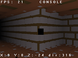 With nothing but a fog on.
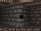 With a point light on, shading by vertex normals.
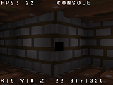 Tile shaded, like The Crawl, kinda.
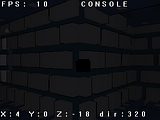 Built in toonshader, didn't work.
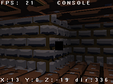 Faked toon shading using spheremapping. Kind of works, some visual distortion. But no impact on frame rate.
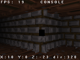 Faked shading, also spheremapping. Same kind of distortion issues and no impact on frame rate.Lighting has some effect, toonshading kills things. There's another toon shader I haven't tried yet.
I think the second looks best
so dark, the second one is the only one i can see clearly.
2nd
I like the fake toon (5th) one, actually.
2 or 5 for me
Thanks for your opinions.
2nd
Second looks like runescape, go 5th.
I believe they do the same thing, using vertex coloring in place of textures. I guess I'll be leaning towards having an option to choose either 2 or 5.
"Second looks like runescape, go 5th." - Ferret
Beat me to it. That said, 2nd or 5th.