Playing around with various display styles for my cubic dungeon crawler. Pic your fave. Although all or most can be included.
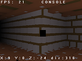 With nothing but a fog on.
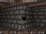 With a point light on, shading by vertex normals.
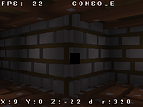 Tile shaded, like The Crawl, kinda.
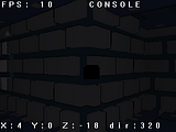 Built in toonshader, didn't work.
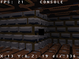 Faked toon shading using spheremapping. Kind of works, some visual distortion. But no impact on frame rate.
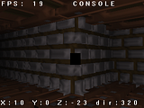 Faked shading, also spheremapping. Same kind of distortion issues and no impact on frame rate.Lighting has some effect, toonshading kills things. There's another toon shader I haven't tried yet.
Go number 5
First is ugleh!
Second is decent, but looked a lot better in the thumbnail. :/Third is far too dark to be of any use.Fourth is worse than the third.Fifth looks really choppy.Sixth looks a tad better than fifth, and kinda combines the second and fifth into something almost tolerable. :/Any particular reason the bricks completely lack any form of texture? That could help things stand out more.Number two.
@zaron
Well all objects are constructed out of a 16x16x16 matrix, faces are colored an no textures used. Except for 3, 5 and 6. 5 and 6 use spheremapping.I vote second and last.
I like the 5th one.
Last one by a mile.
Well I decided to use the 2nd, and 5 and 6. I found that for some odd reason, on crappier computers, using the spheremap method is faster then no light and no textures. Odd. Also it runs fast on an old G5, which is pretty nice.
second or third