More updates/mockups/etc

 Water: Attempted to fix.Character classes so far (From left to right):Original reference characterSwordsmanDark Knight PaladinDragoon Older Stuff
I restarted the concept tileset because I didn't like the way the other one was going.Also, I did so after playing much LoZ (Link to the past, Link's awakening).So here:Pixellated Version I started working at half-res (12x12) then scaled it up to 24x24 and started doing this:Higher-res version
 And I threw in a sample of my character just to see if it could fit in. First person to try make a Final Fantasy style midget for this gets shot. NO EXCUSES. :DOther artistsIf you're going to be helping at all with this, please say so now and tell me what you're doing so I don't end up doing it for you. =P
I started working at half-res (12x12) then scaled it up to 24x24 and started doing this:Higher-res versionAnd I threw in a sample of my character just to see if it could fit in. First person to try make a Final Fantasy style midget for this gets shot. NO EXCUSES. :DOther artistsIf you're going to be helping at all with this, please say so now and tell me what you're doing so I don't end up doing it for you. =P

Bump'd.
Looks nice, I just don't like the second palette.
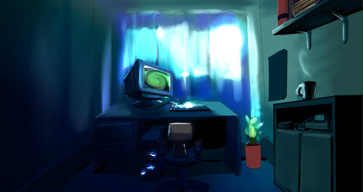
Water needs more texture. But they look nice. Dark rooms would have to be used appropriately.
Tile-sheet would be lovely. :)
This is lookin' straight-up boss.
I mean, even if you make a gradient around the edges a tiny bit, it may help to make it look less like a curtain or something.
I just got my computer fixed so I can provide some help if needed.
Any sort of art would be appreciated, in either pokemon style combat way, UI design, or the 2/3rds view (?) that mega has started